Brief
Spredfast needed a new method for creating on-brand, visually cohesive presentations...because the old way WASN'T working and folks were pissed. These problems plague many businesses...rando slides, terrible design choices, folks using inappropriate messaging and visuals, using presentation templates in their own 'personal style', you get the picture.
Process
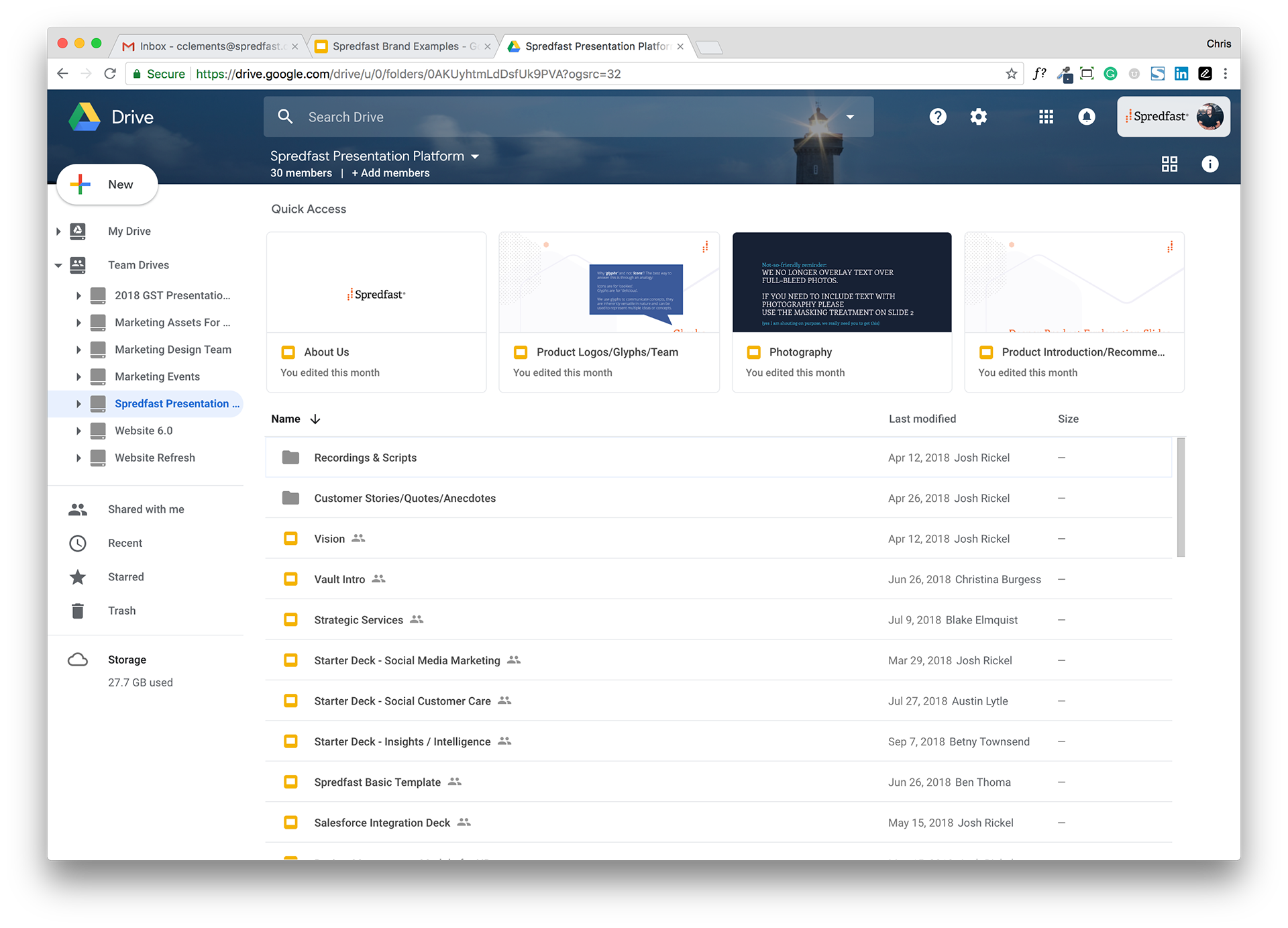
By completely rethinking our template approach and standardizing around G-suite, we crafted a solution that led to high adoption across the company. We leveraged centralized master decks which were linked out to various 'starter decks', providing clearly understood and designed content that anyone could grab and use. All messaging and visuals were crafted and designed so we presented company and product messaging in a clear, consistent way no matter who was presenting. Slide linking unlocked the ability for users to quickly update linked slides with the click of a button, without having to hunt down 'that new slide they saw the other day' anymore.
Competencies
Creative direction, Graphic design, Presentation design, Training
Key Metrics
Completion of content for identified support areas, accessibility for all company employees, consistent use of the template, (qualitative) speed to create on-brand presentation, speed of content searching/discovery, ease of updating pre-existing content
A bit more context about this project:
Spredfast was in need of a new presentation template (or so they thought). What was really needed was a complete rearchitecting of the company’s approach to how presentations were built. The company was suffering from typical branded presentation struggles...rouge presentations, slides that were cobbled together from years-old decks, and very little time or attention paid to the branding and design of the slides.
After a great deal of consideration, evaluation and discussion, the core team decided on several key requirements:
1. We had to standardize on Google Slides. Spredfast was a Google shop, and this was the obvious tool to use to ensure all users had access to the same toolset.
2. We needed to design all the slides. If we were to increase the delivery on-brand presentations from everyone in the company, we knew we had to take on the responsibility of designing every iteration of our most commonly used slides.
3. We needed to provide training. We knew we were going to be taking a lot of folks out of their comfortable Powerpoint worlds, so getting them up to speed with Slides and arming them with usability tips and tricks was critical.
4. It needed to be a choose-your-own-adventure model. Many of the company’s presentations are developed quickly in response to sales and customer requests, so enabling users to quickly copy and paste pre-made slides from a variety of starting points was required.
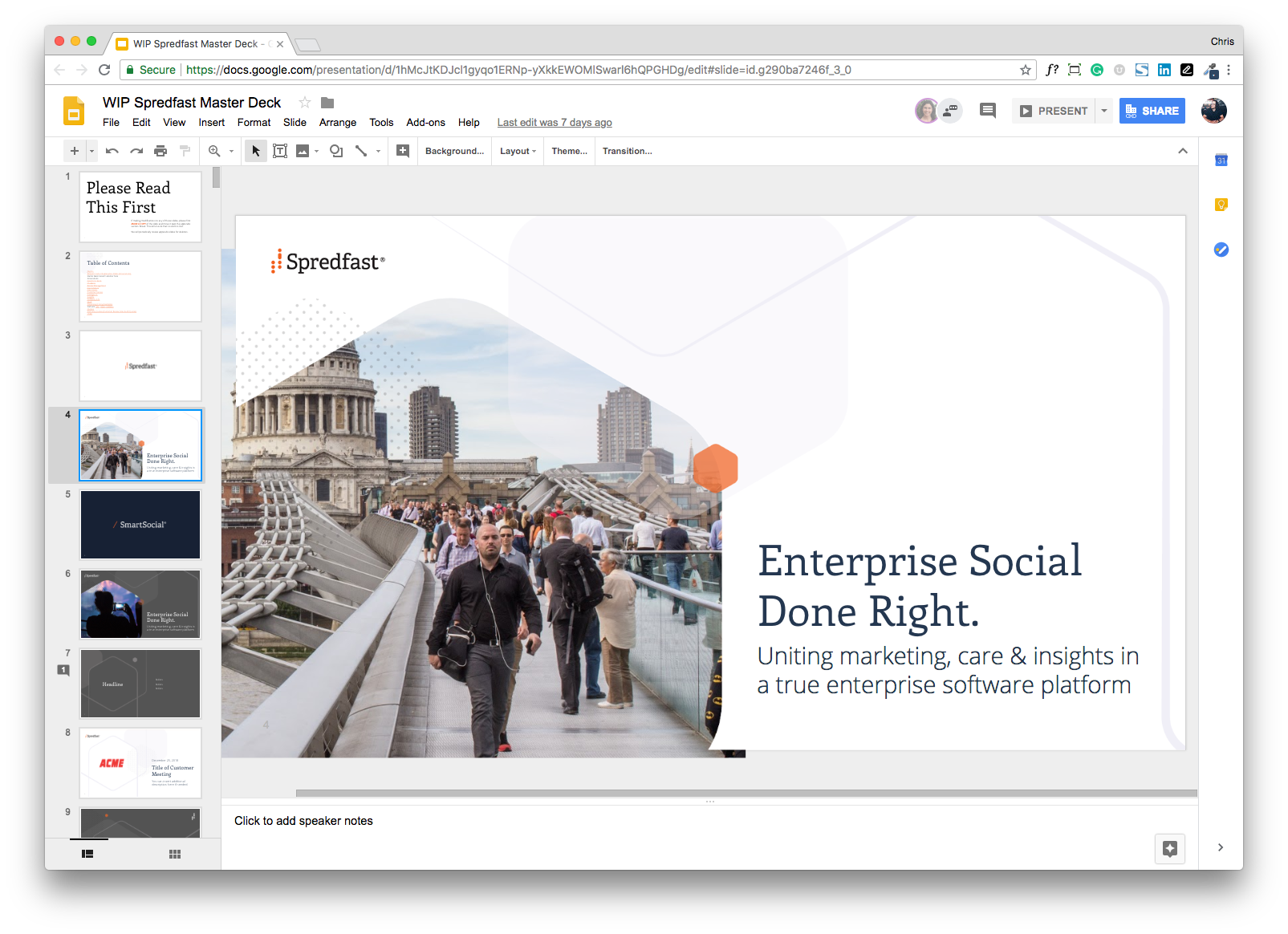
The presentation platform master deck:
A single source of truth for branded messaging, positioning, and presentation assets:
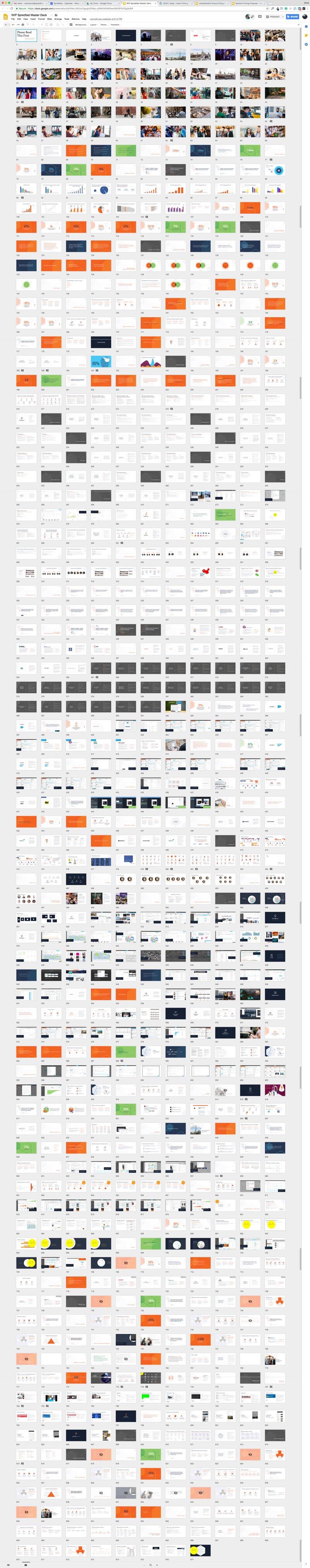
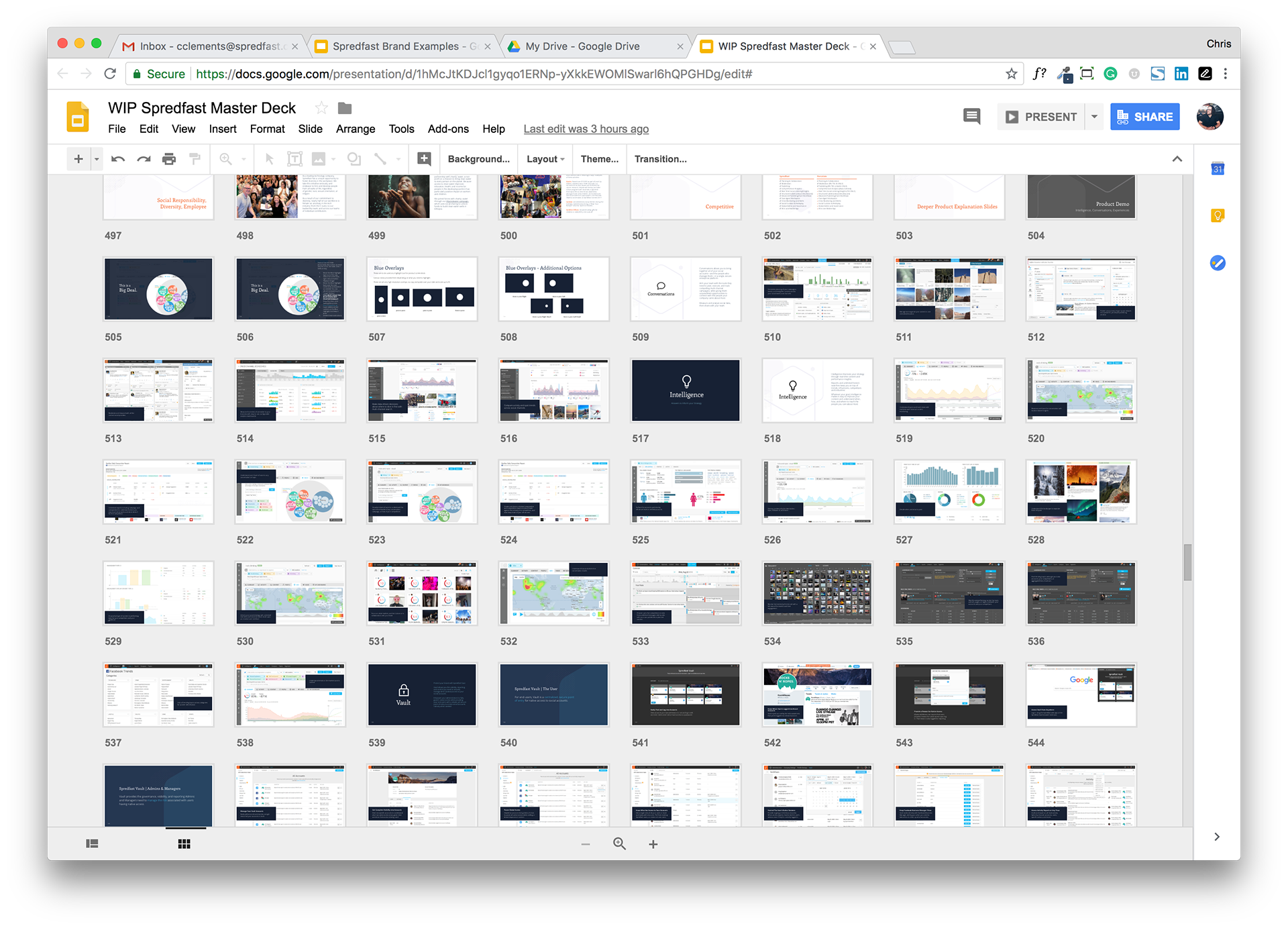
Starter decks were populated from a master library of over 900 designed slides:
We treated this solution like a product, continually iterating on new layouts that were deployed as they became available:
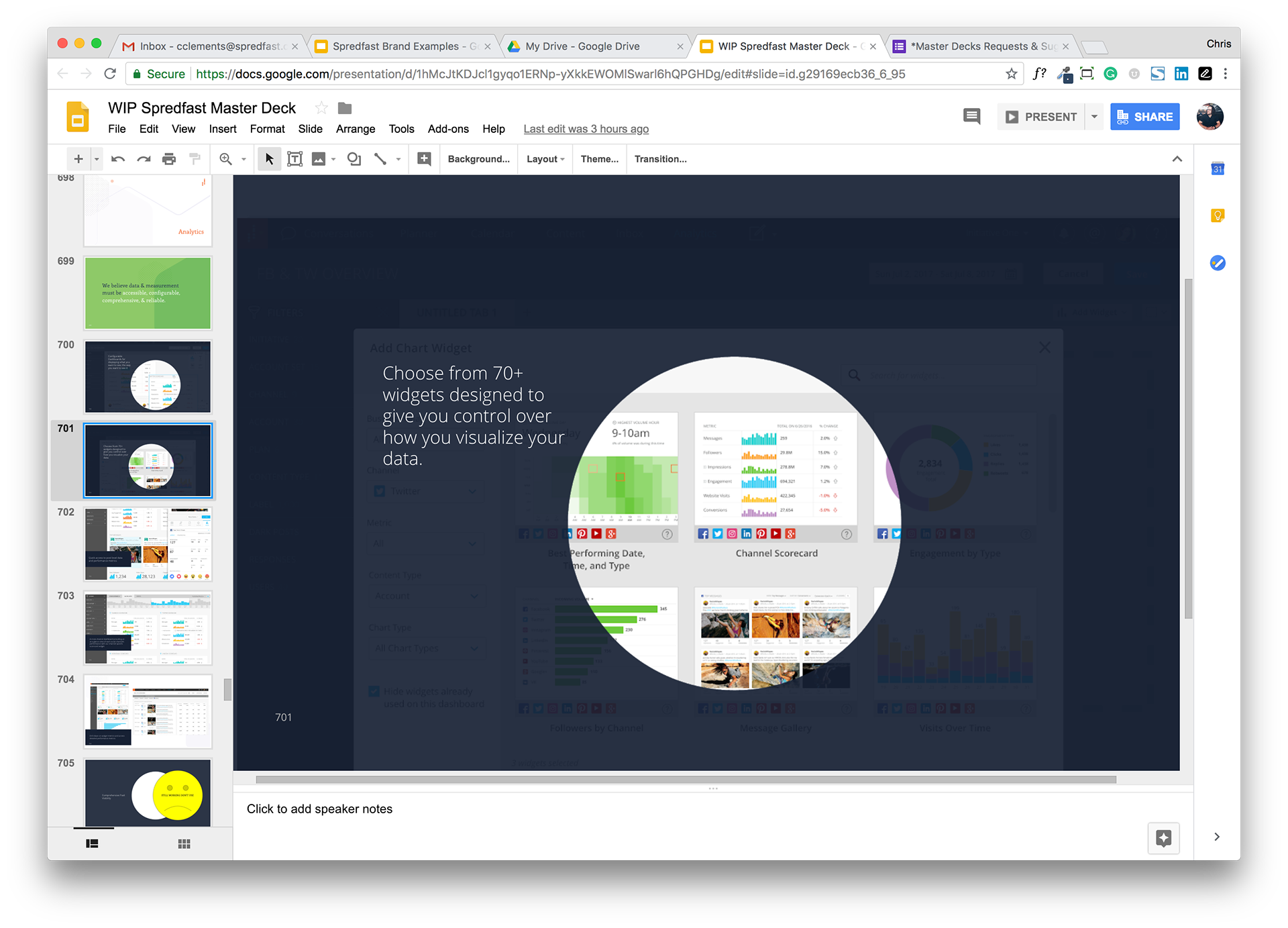
We provided design solutions like this screenshot mask that were reused and repurposed easily:
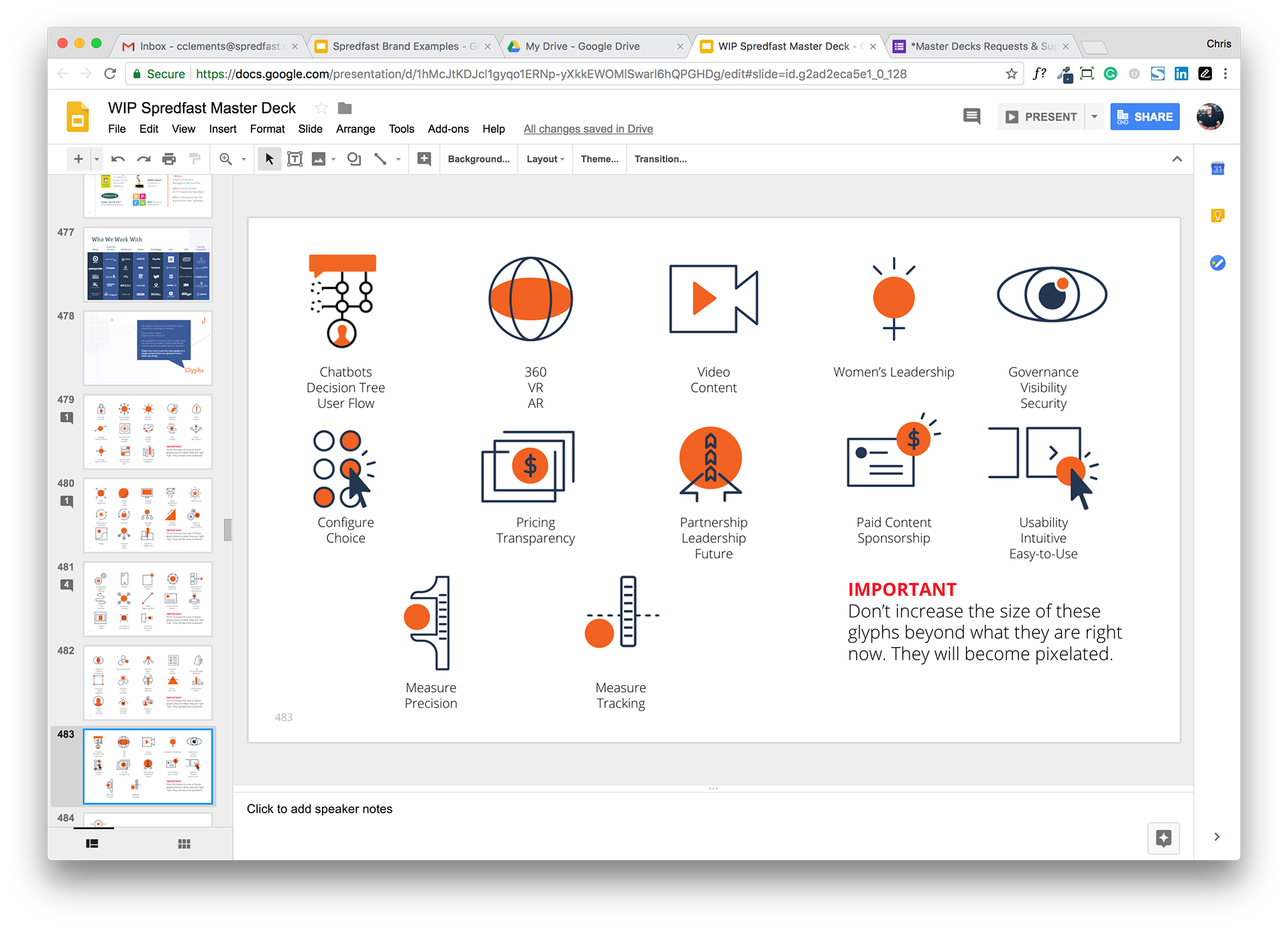
We designed a library of glyphs that took on a variety of meanings when combined with copy: