Brief
When I arrived at Upland, the company was beginning a major transition in operating style and GTM strategy, and they needed a fresh brand to help re-introduce the company to the world. Additionally, the old brand system was virtually unusable, without many of the tools and trappings that a modern, extensible, and accessible has to have. Additional considerations were a wide variety of stakeholder groups (as Upland is a public company) as well as their decentralized, hub-and-spoke internal structure with certain functions sitting at a 'corporate' level, and individual business unit marketing teams.
Solution
Upon realizing the scope and scale of this effort, and considering the very limited internal resources, we knew we needed to bring our creative, design, and branding networks to bear on the project. Collaborating across key internal teams, we brought in critical partners Unfettered and The Graphic Standard to get things rolling. Together, we guided key stakeholders through a robust discovery process that helped us land at core company values, brand promise, and stack hands market positioning where we knew Upland could really be competitive.
From this foundational information, we quickly explored visual expression, honing in on a new visual brand that fit Upland perfectly, and would continue to grow with the complexity and size of the company for years to come.
From this foundational information, we quickly explored visual expression, honing in on a new visual brand that fit Upland perfectly, and would continue to grow with the complexity and size of the company for years to come.
Competencies
Creative direction, vendor management, project planning, outsourcing, graphic design, illustration, UX, education & training
Key Metrics
Completion of key brand assets (web experience, brand system and components, templates, guidance documents, etc), usability and access, buy-in from key stakeholders and executive leadership, competitive within peer set, clarify values and brand promise
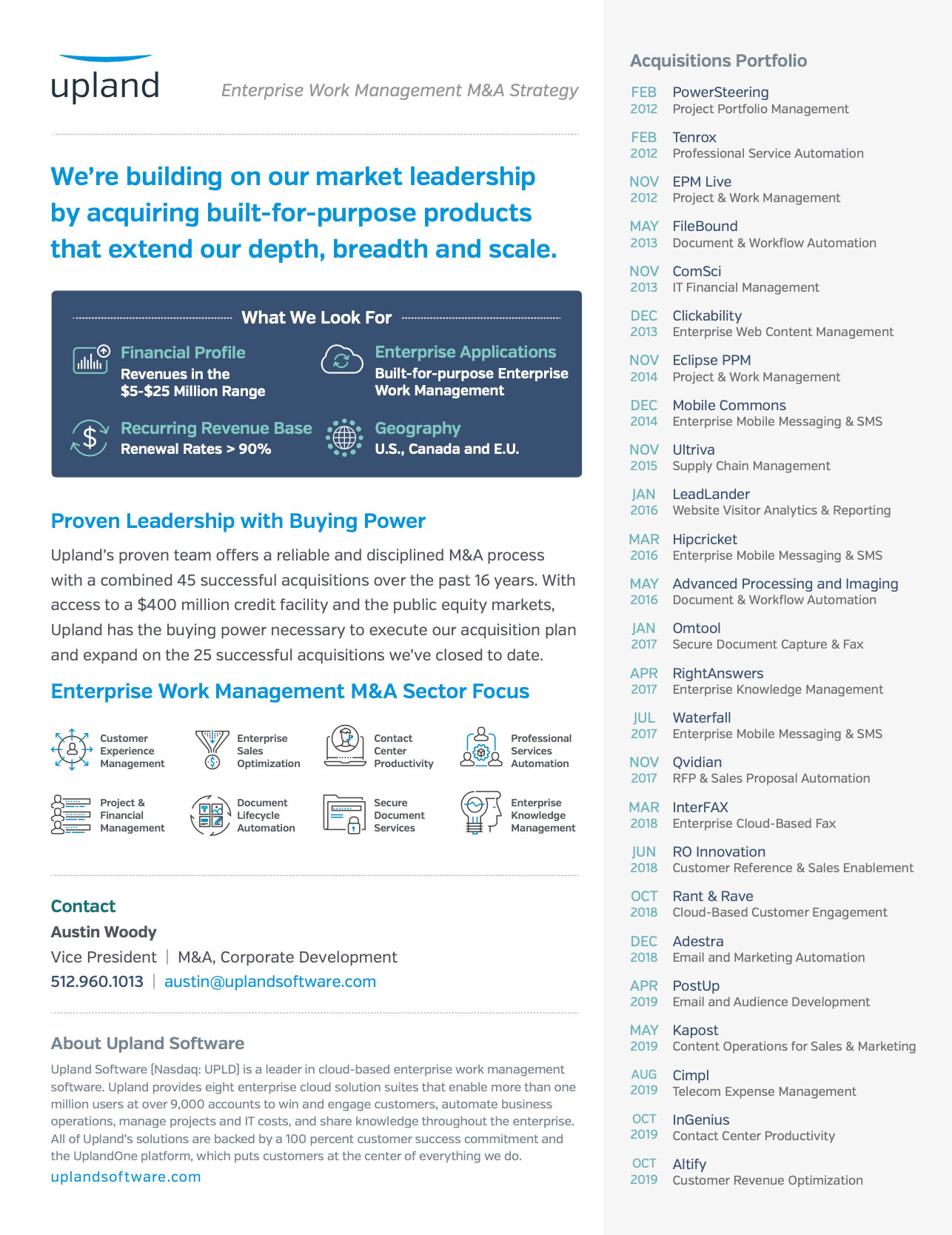
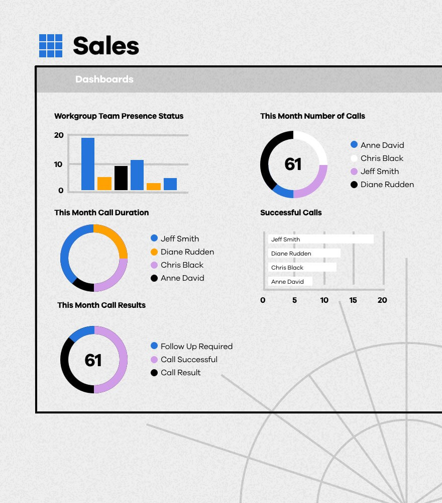
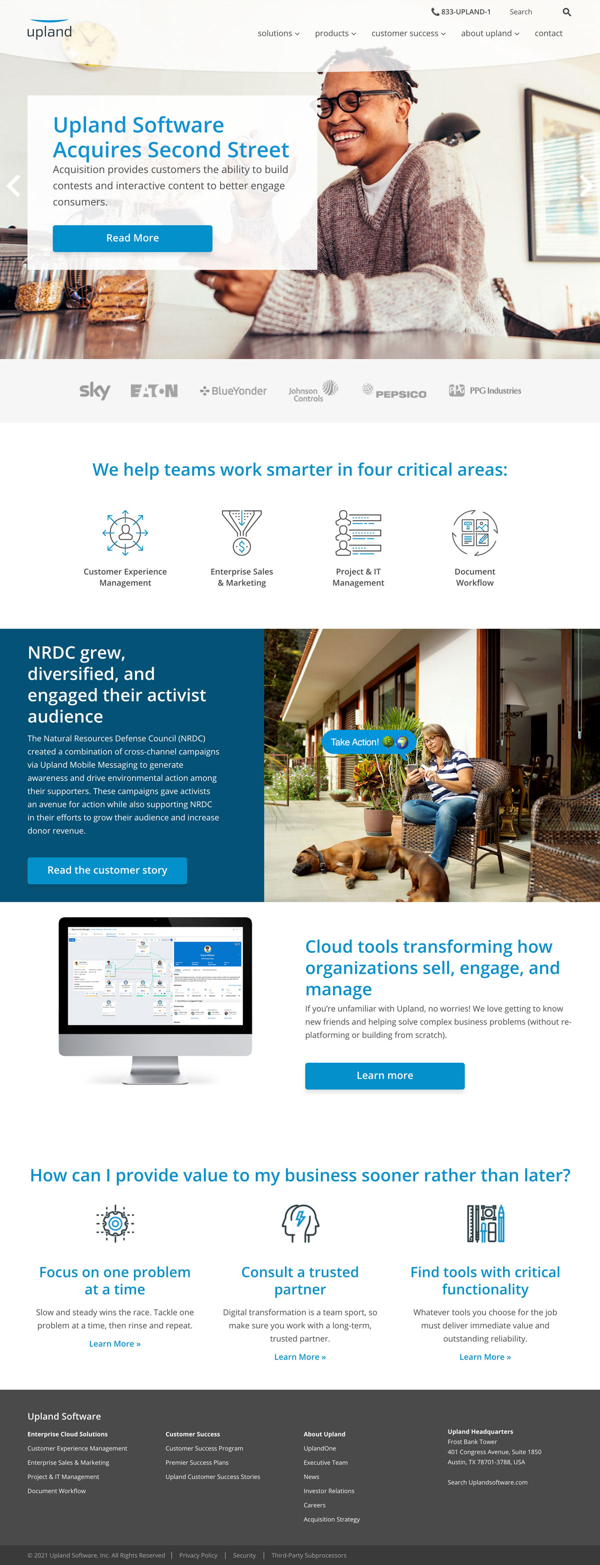
Here's a brief look at how Upland was showing up in the market pre-refresh. Drowning in a sea of same, the company's communications were uninspiring, bogged down with superfluous language, and unable to clearly communicate.
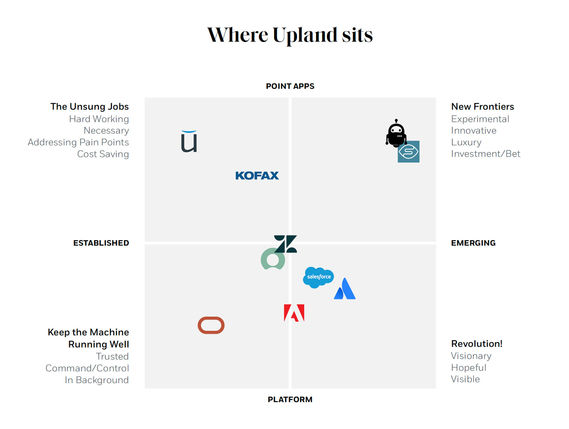
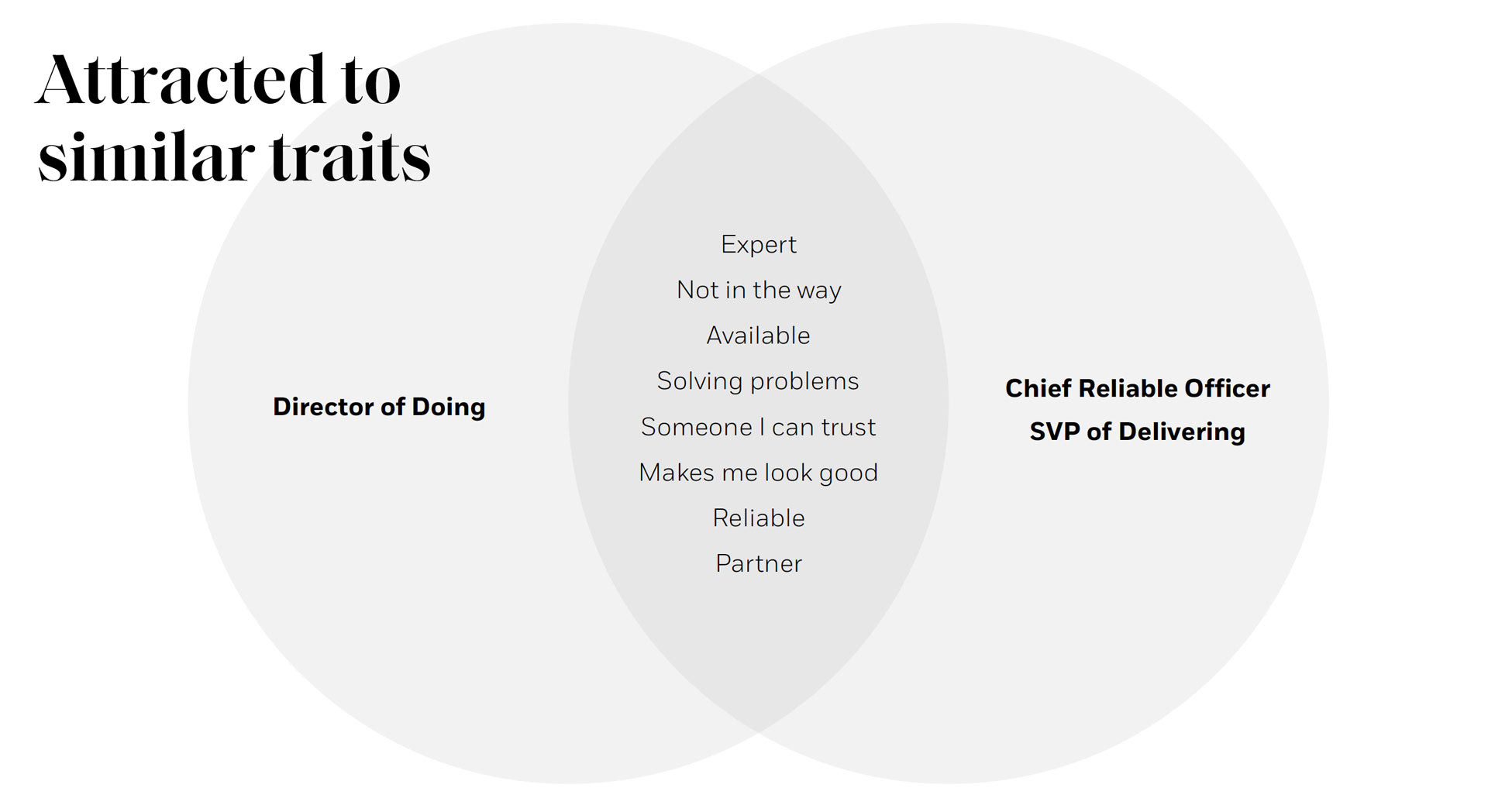
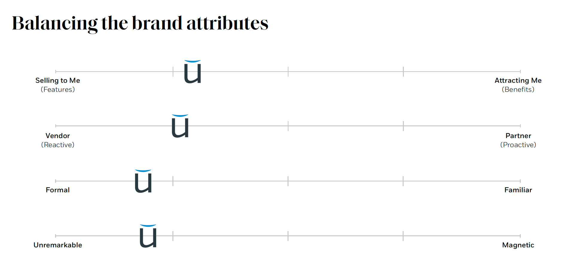
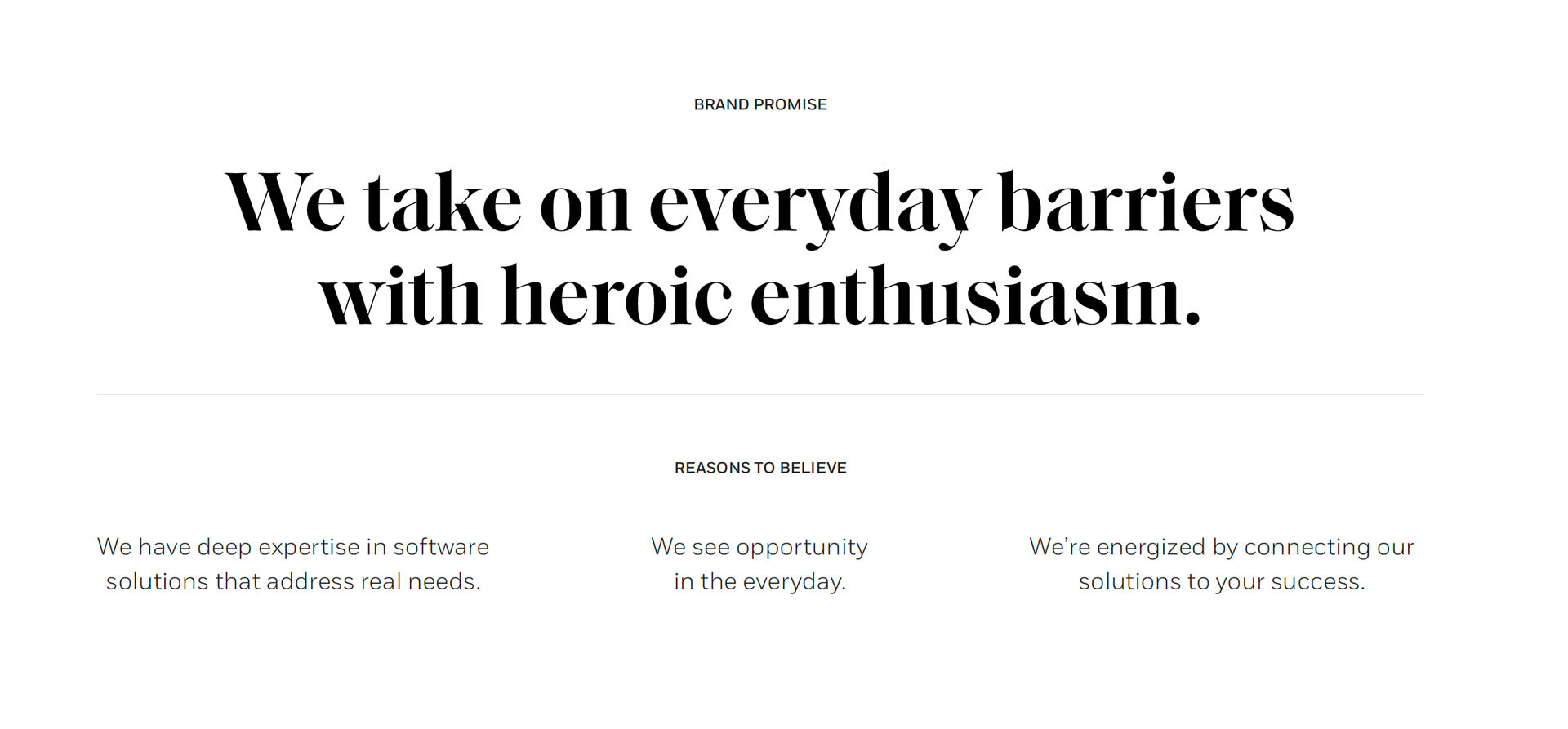
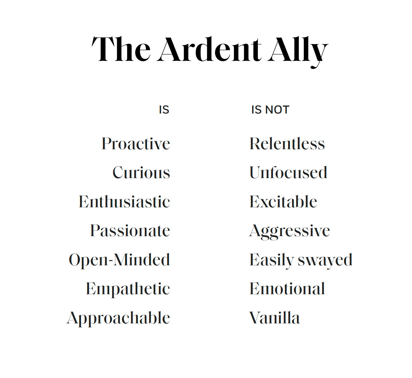
Here's a look at some of that foundational work identified early on, focusing the key stakeholders in on values, market positioning, and value proposition / promise:
Moving into visual exploration, the design team was able to guide the stakeholders towards the most successful execution (also our favorite) and sold the new direction through with little meaningful friction.
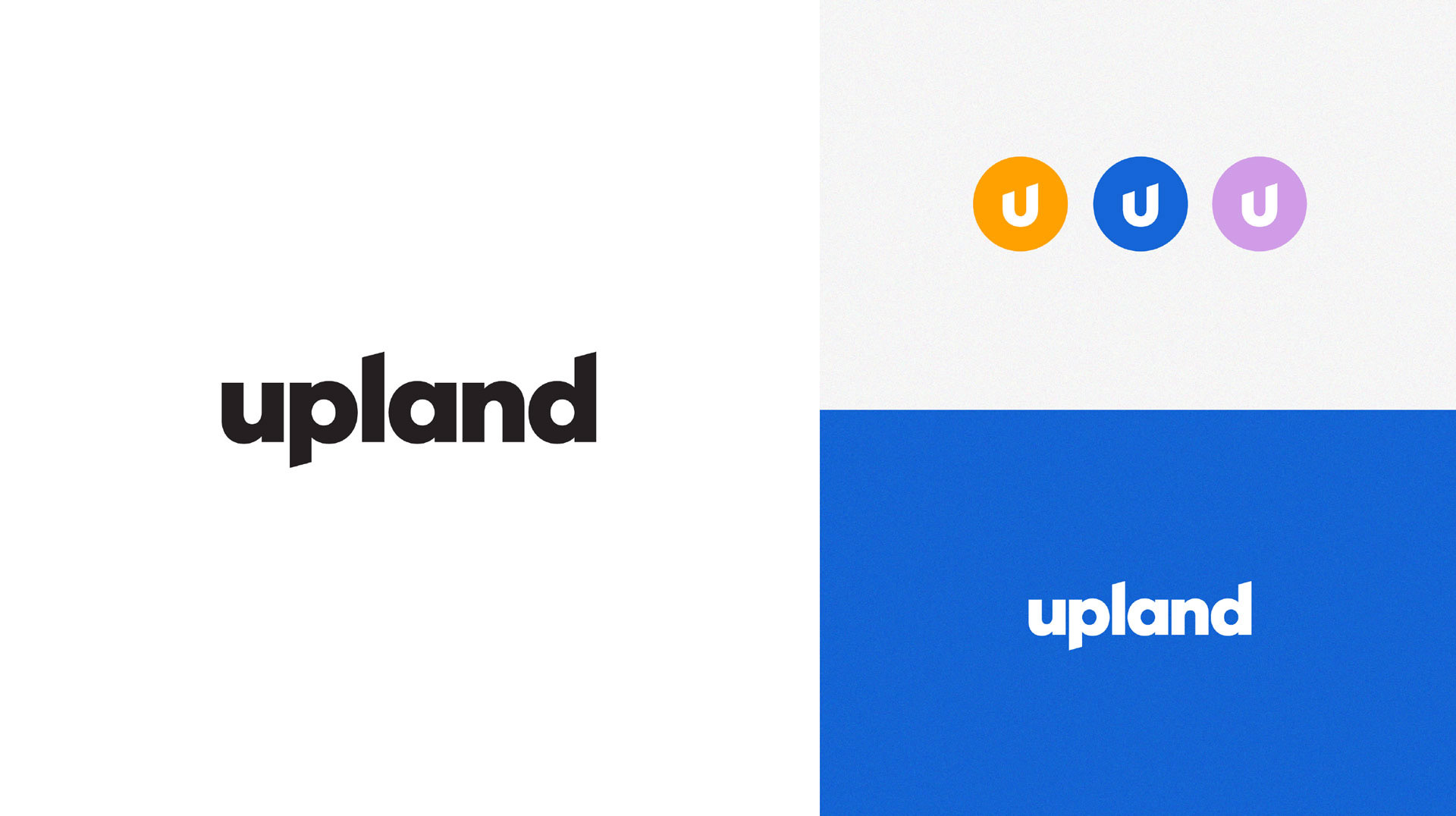

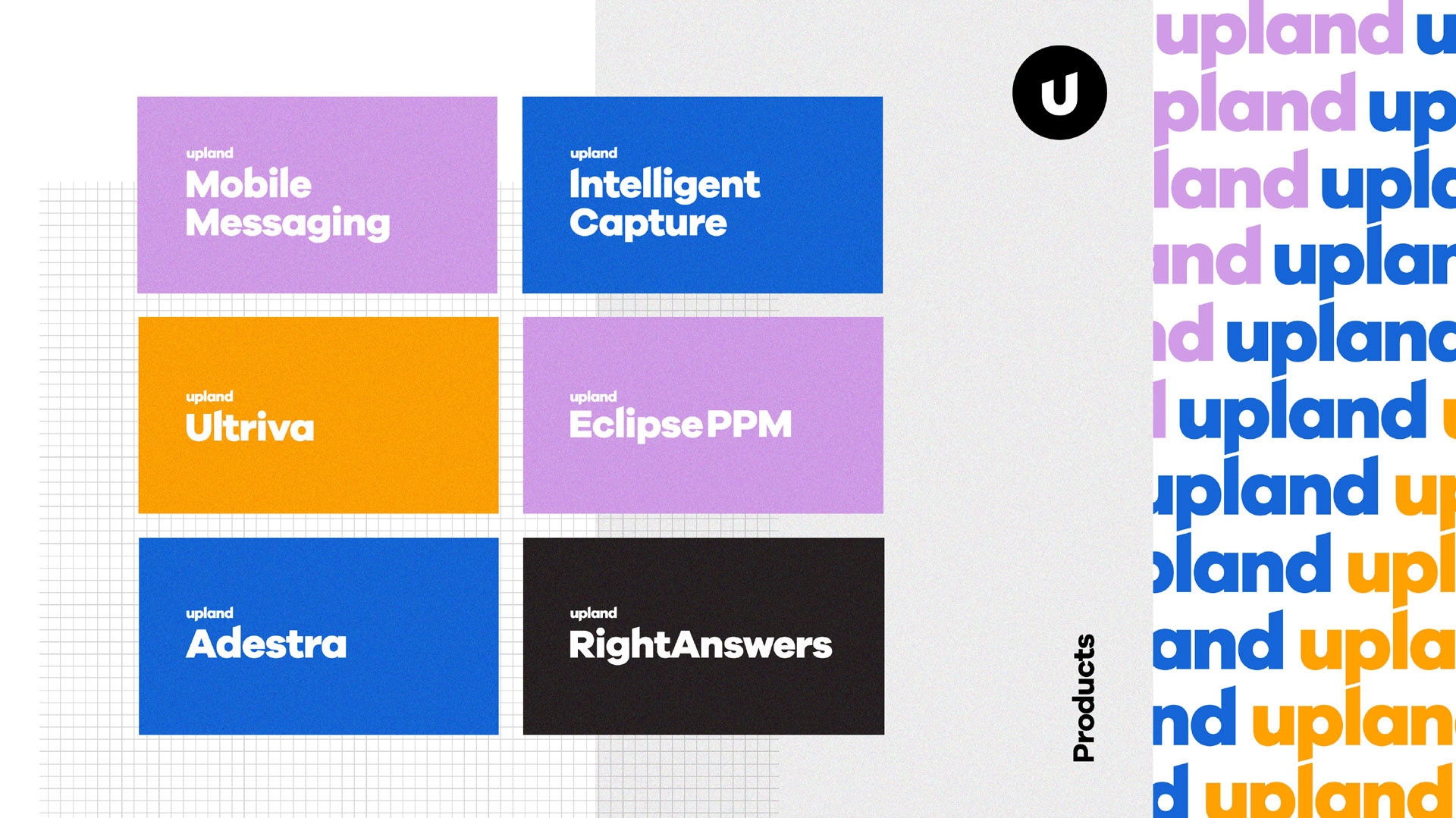
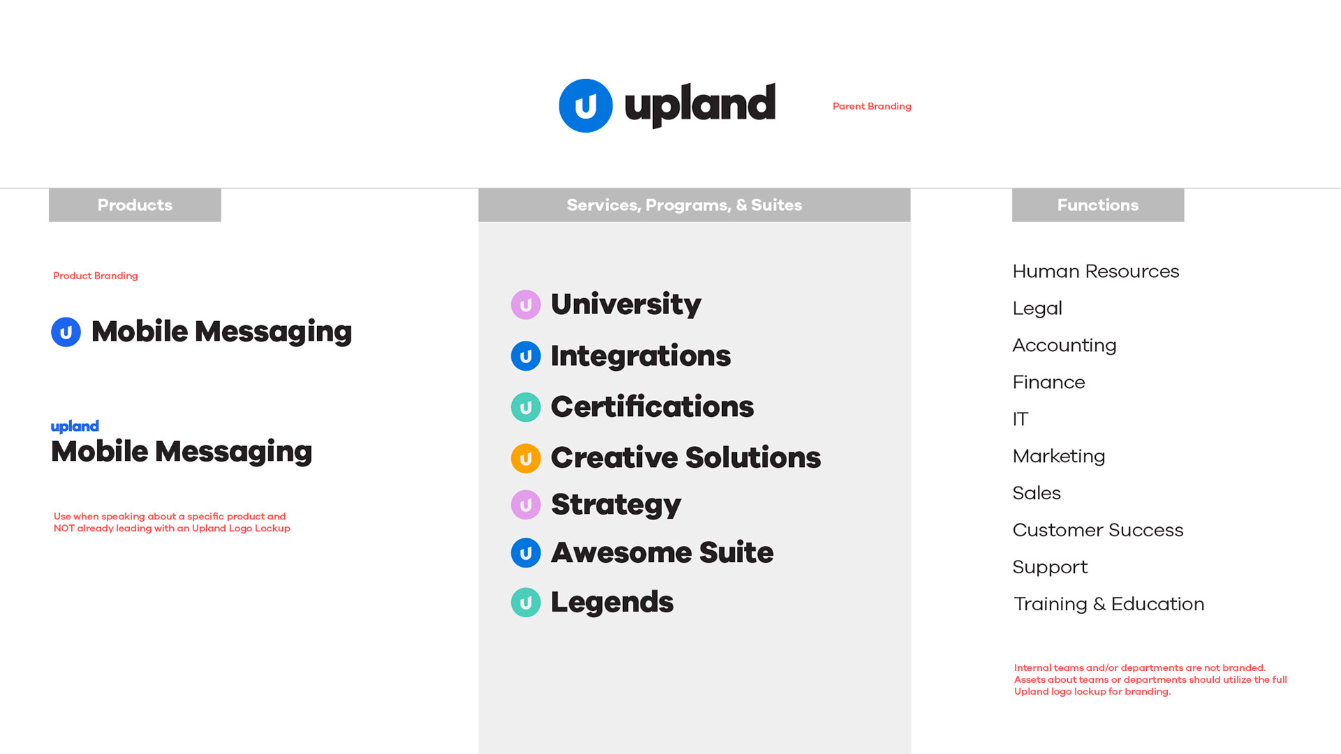
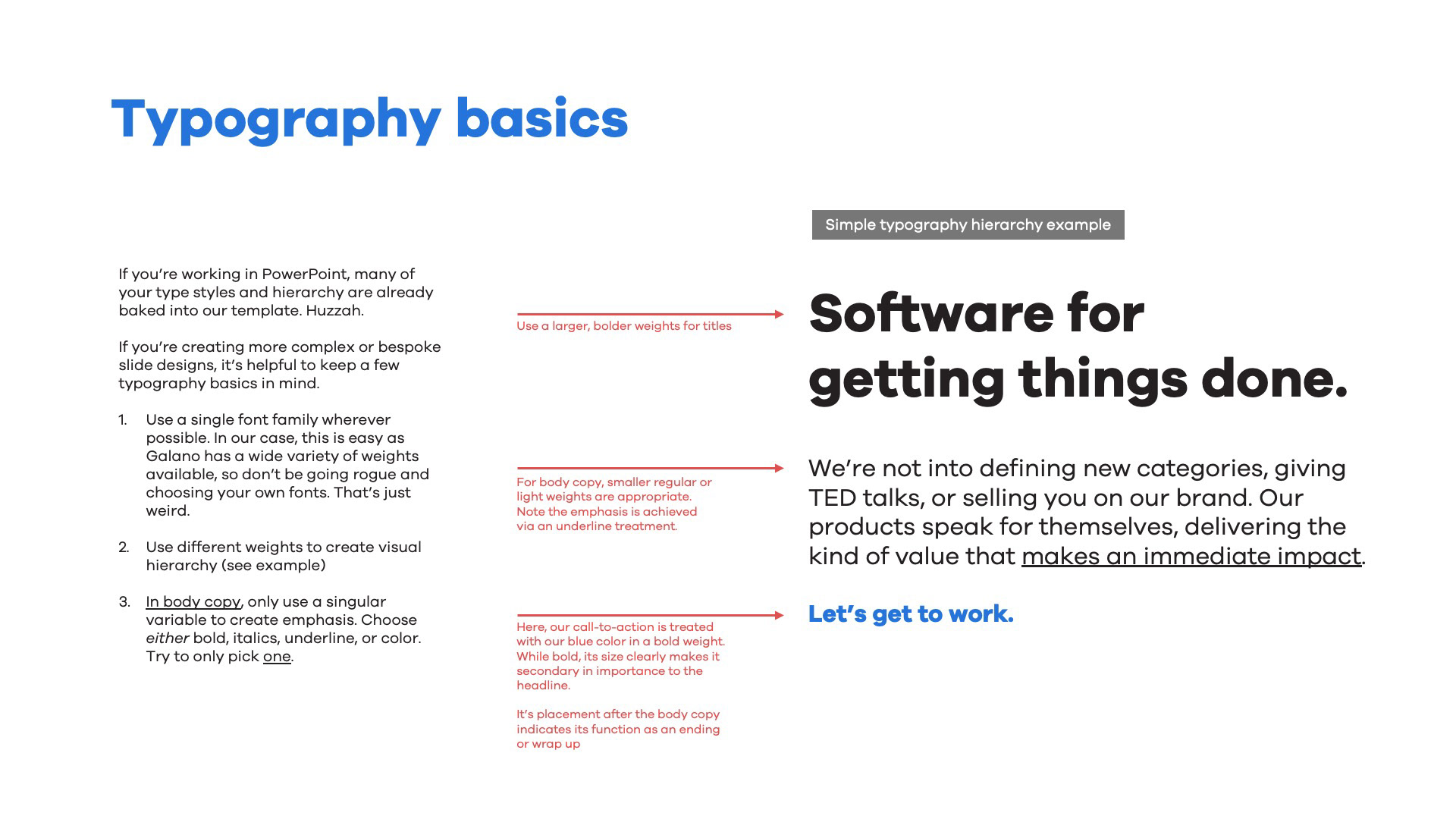
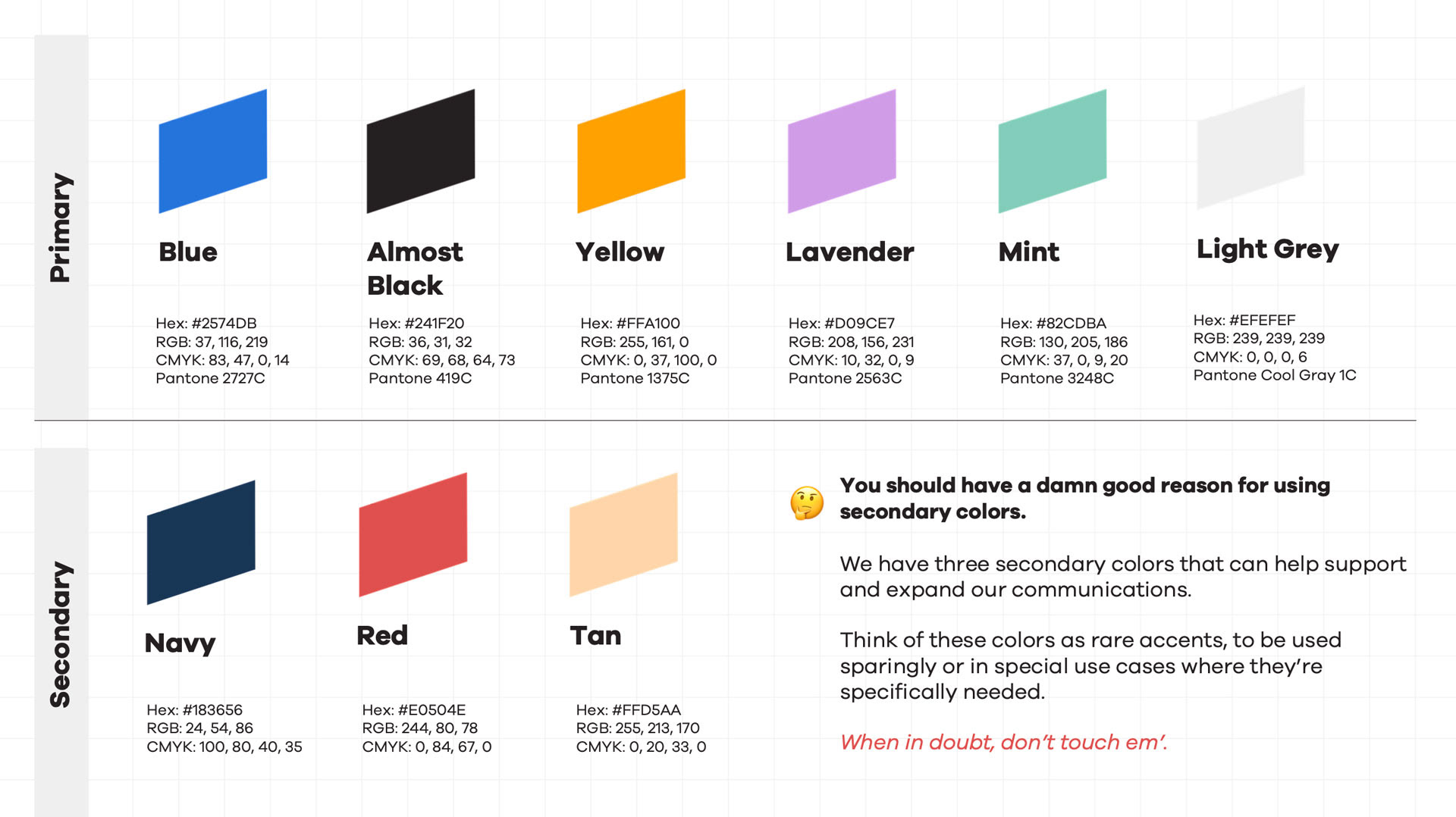
Here's a closer look into a few of the refreshed brand system components, starting with the refreshed logo and hierarchy:

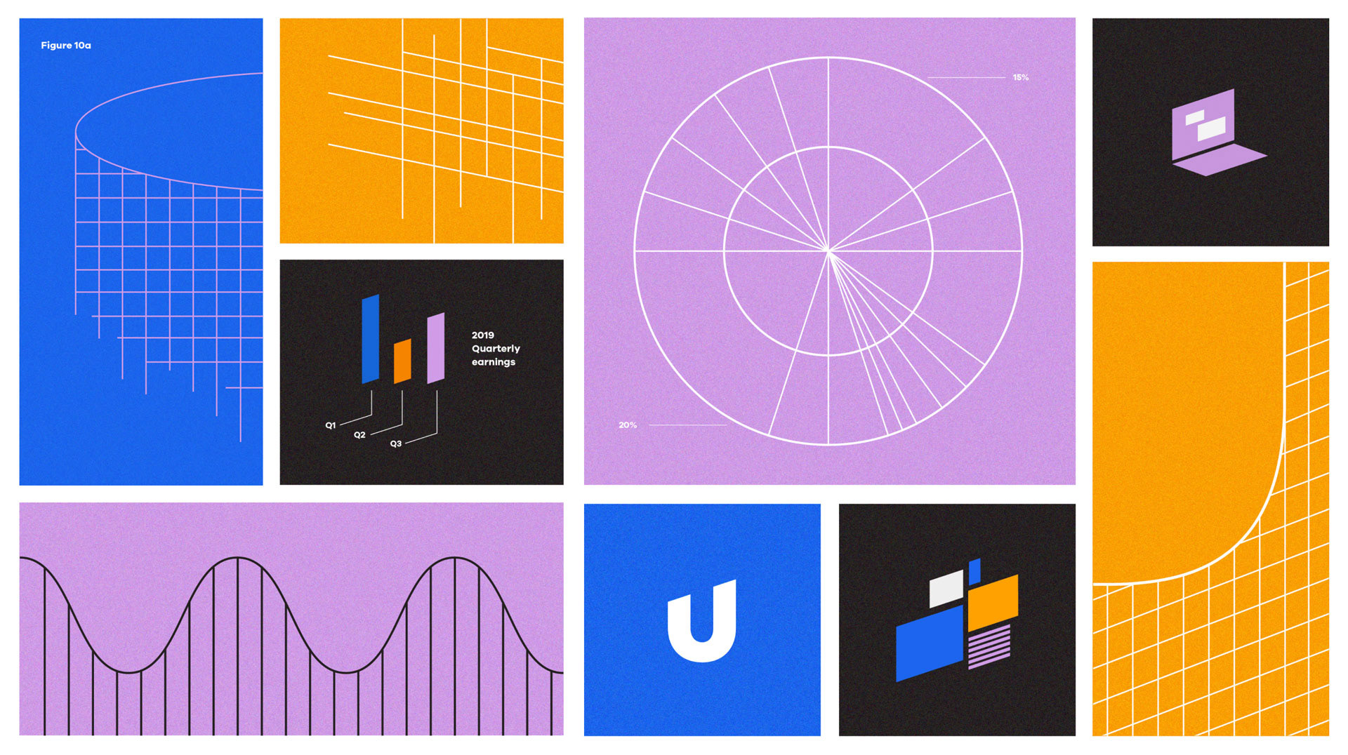
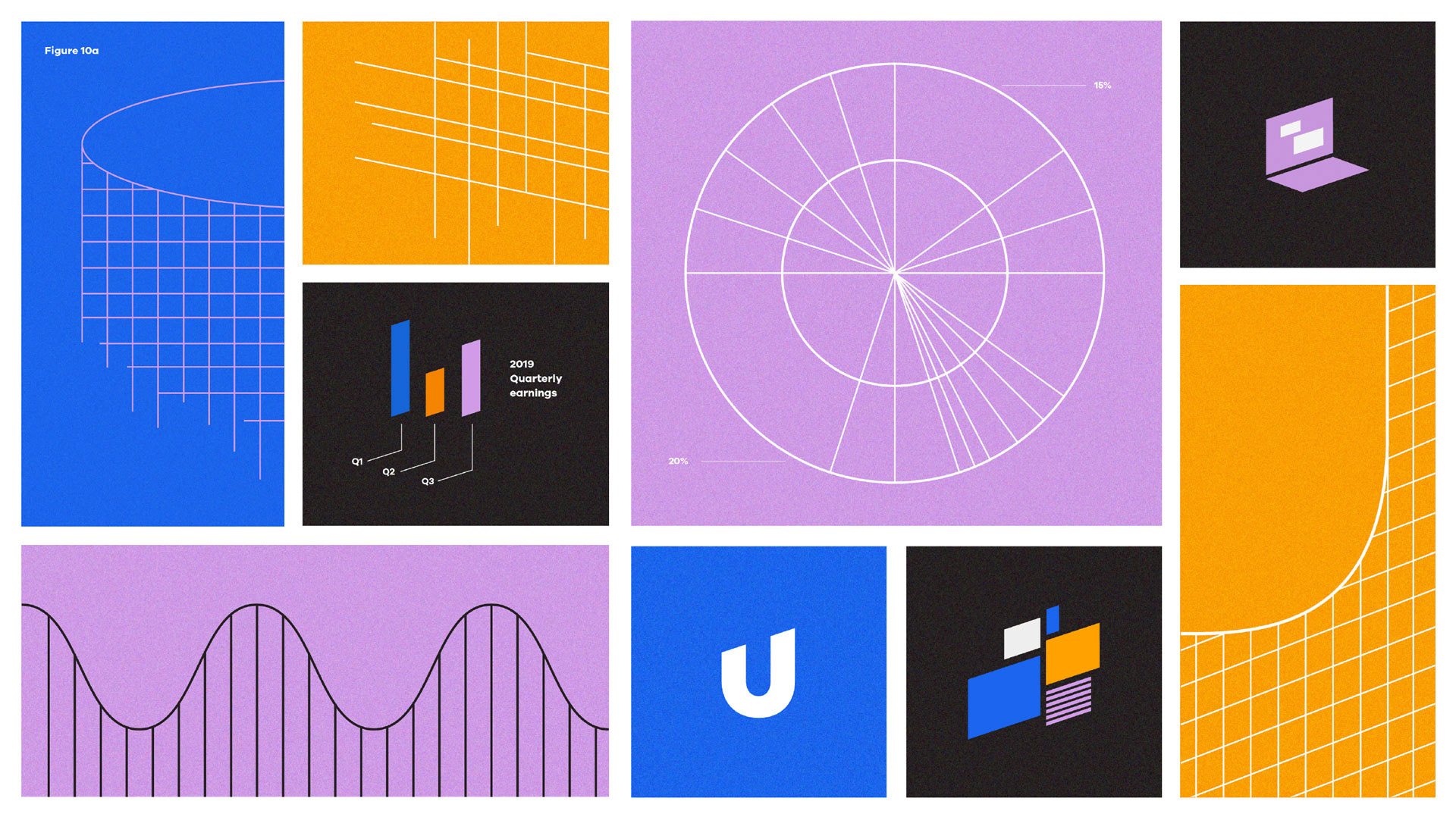
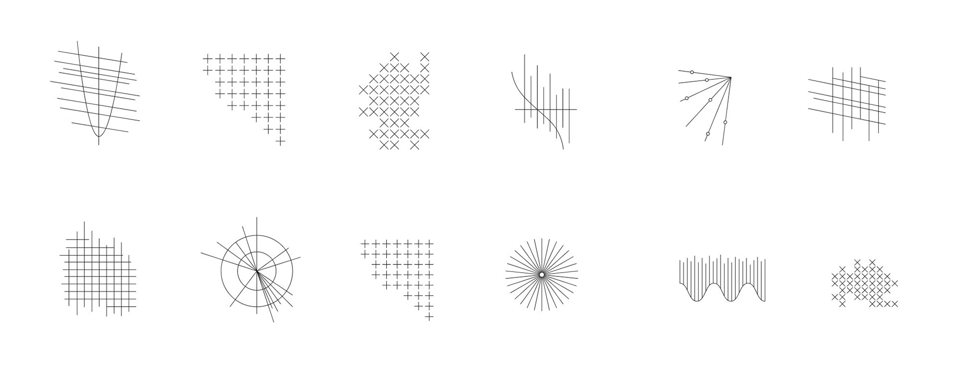
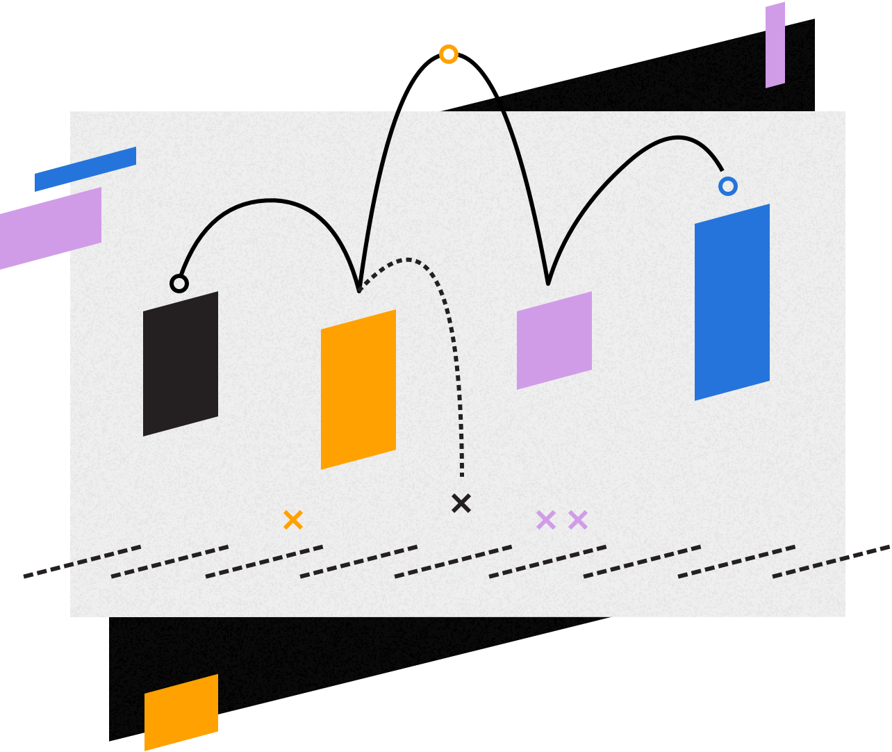
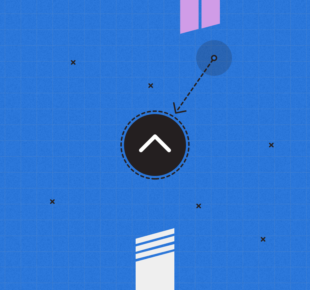
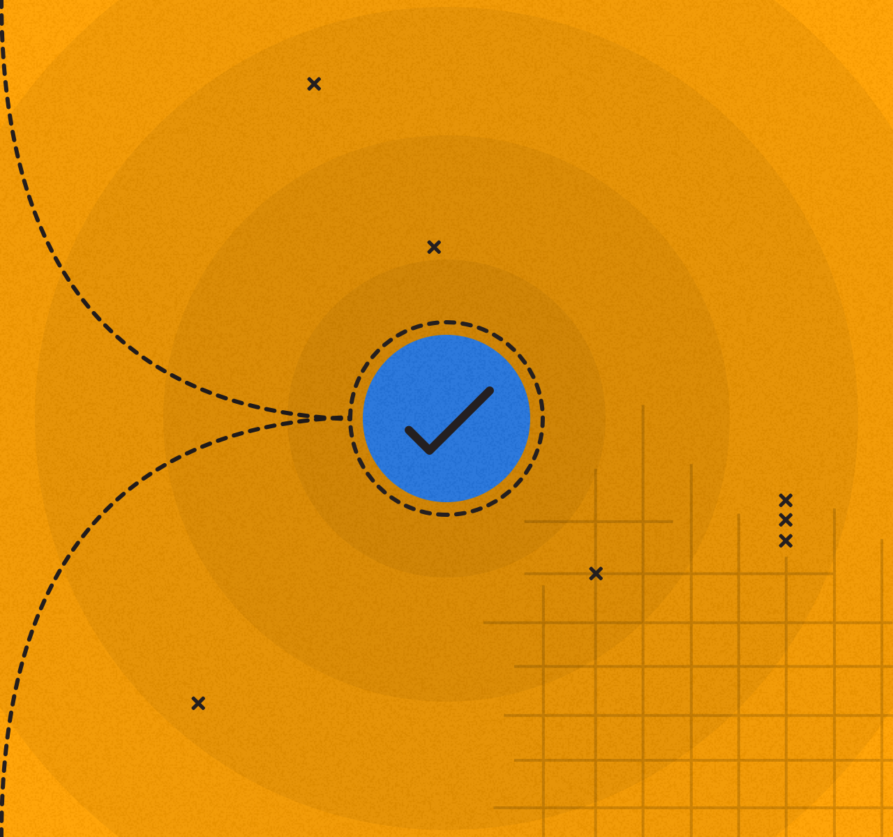
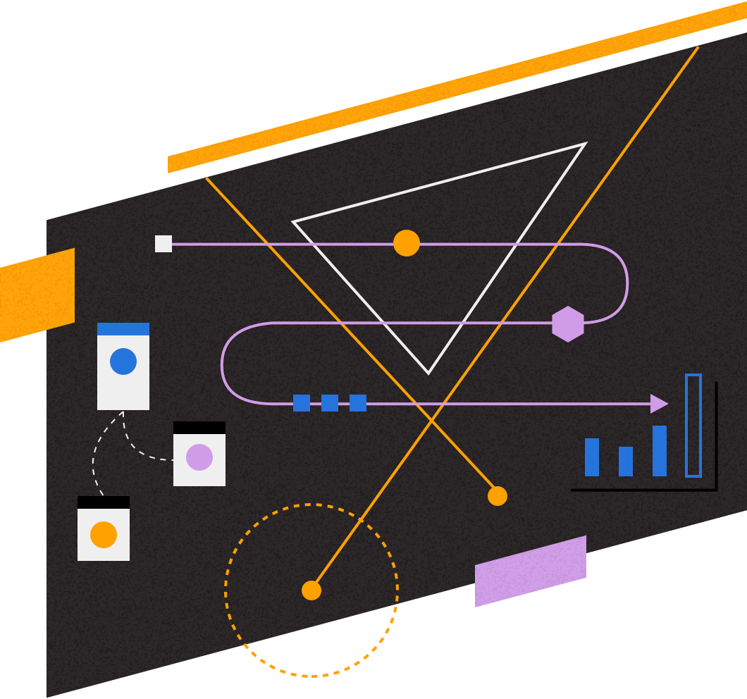
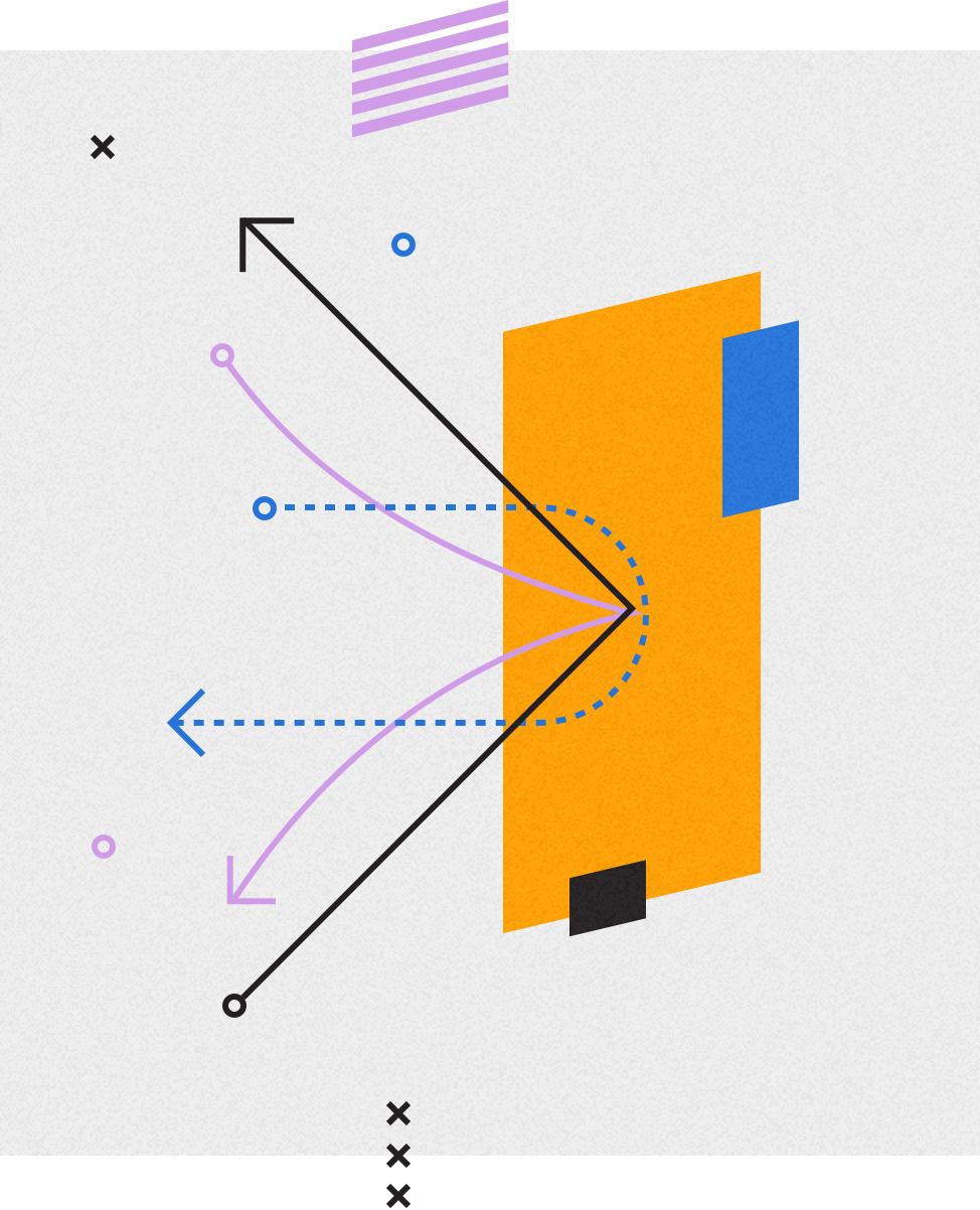
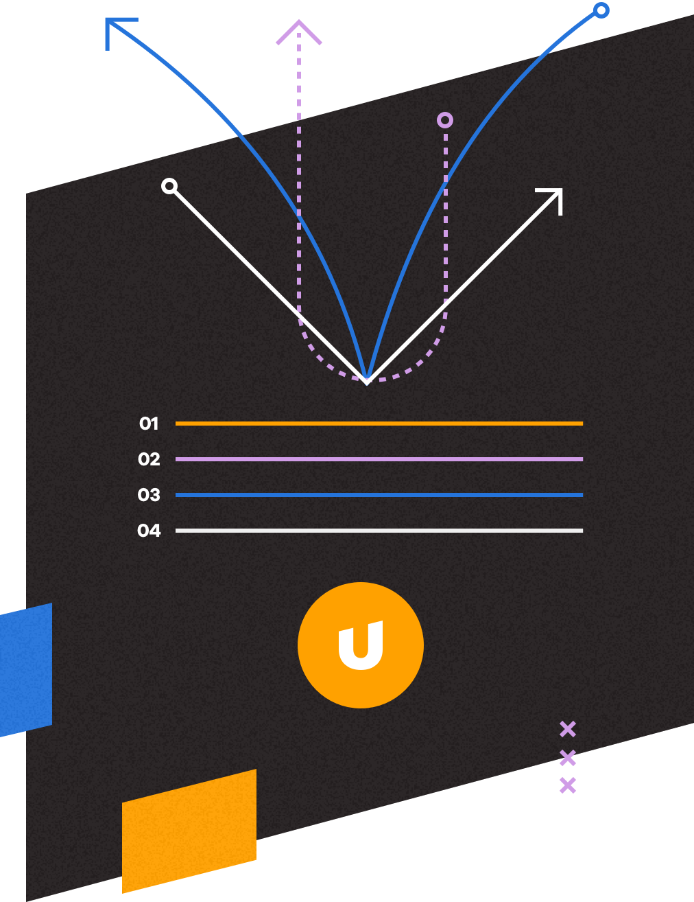
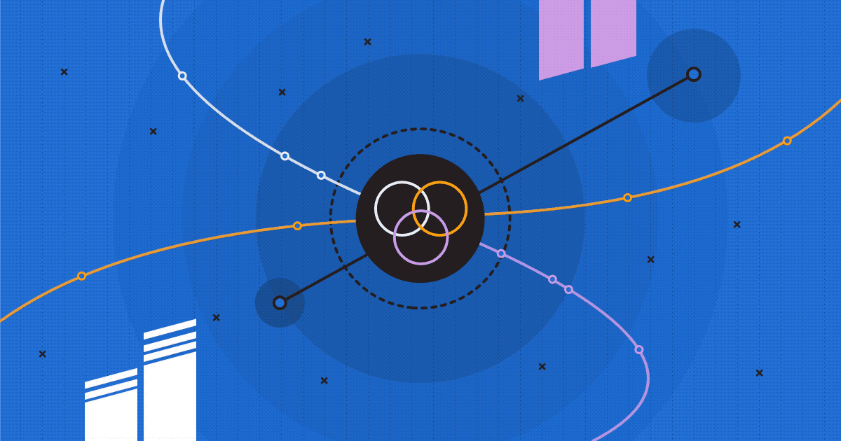
Simple linework illustrations we call 'elements' act as grounding and foundational visuals that help reinforce feelings of order, intention, logic, and precision. These are used in a variety of ways across the brand system, further extending the number of visual options users have at their disposal.
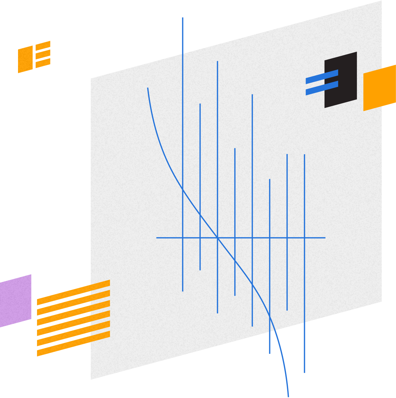
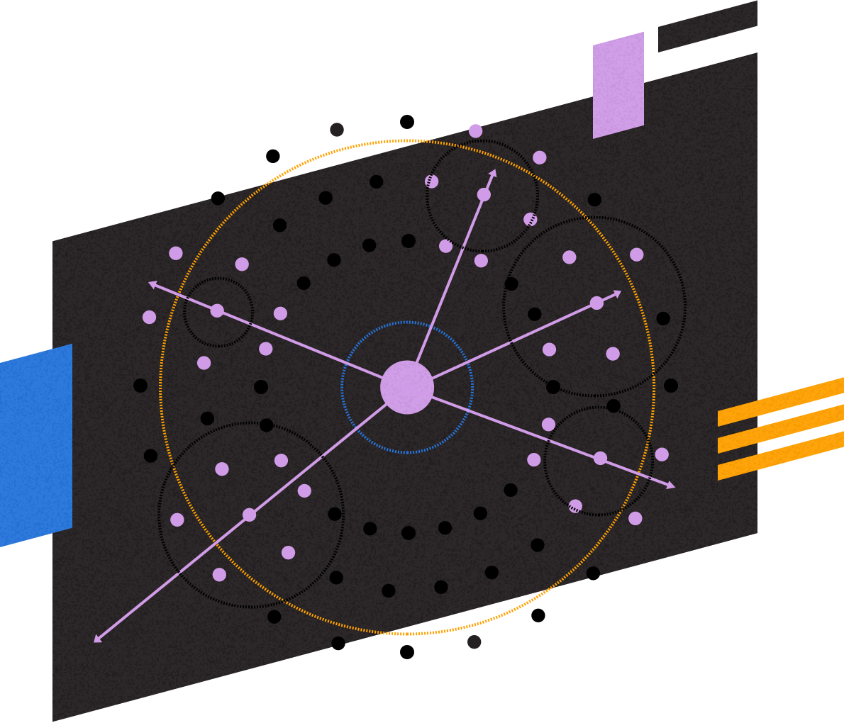
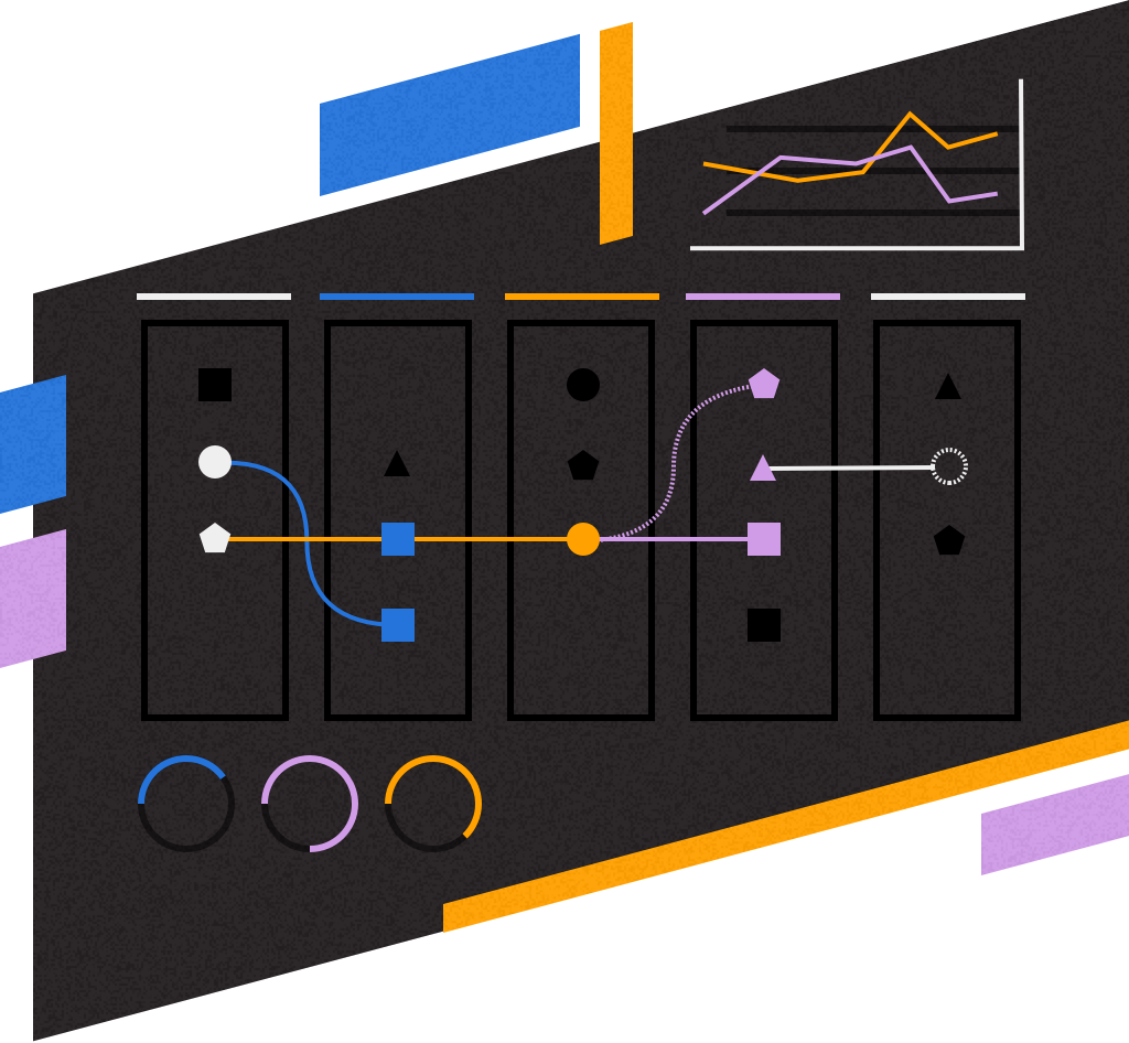
Instead of leveraging traditional iconography sets, we opted to introduce 'geometries'...small, glyph-like visuals that unlock more conceptual storytelling capabilities, especially when used in the context of presentation. Rather than finding that 'perfect' icon from a set that aligns to your messaging or story, meaning is assigned to more abstract forms, again nodding to the flexibility of this system.
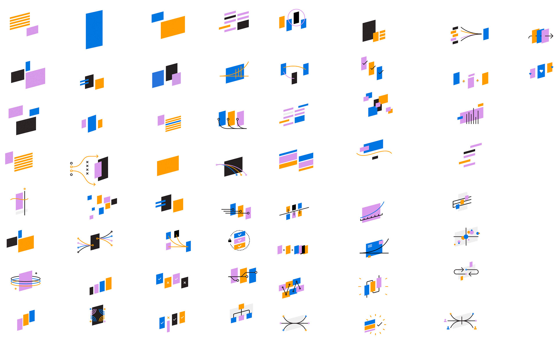
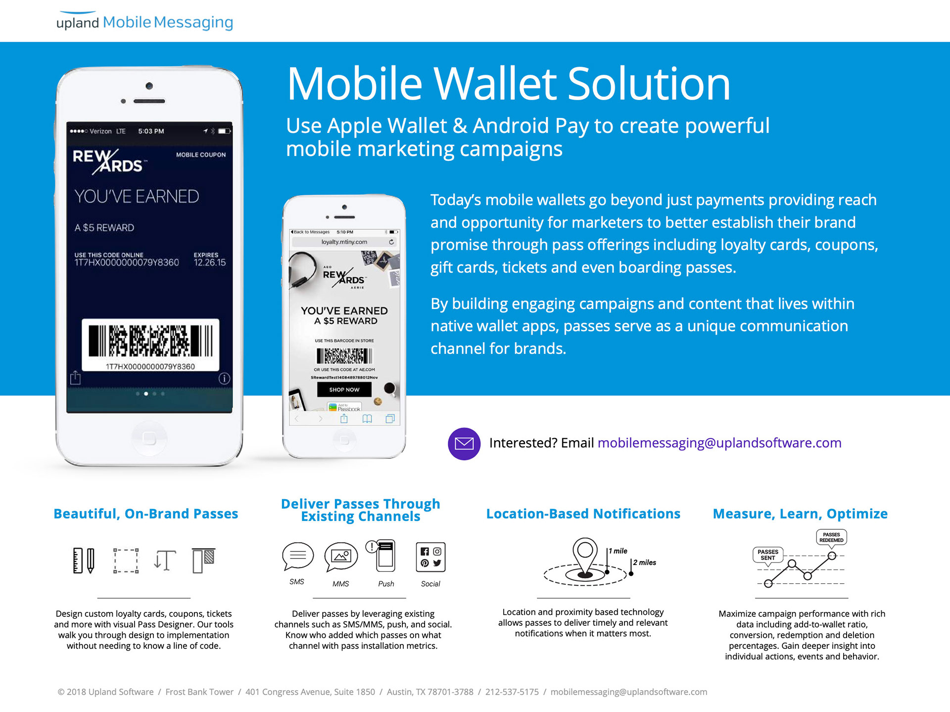
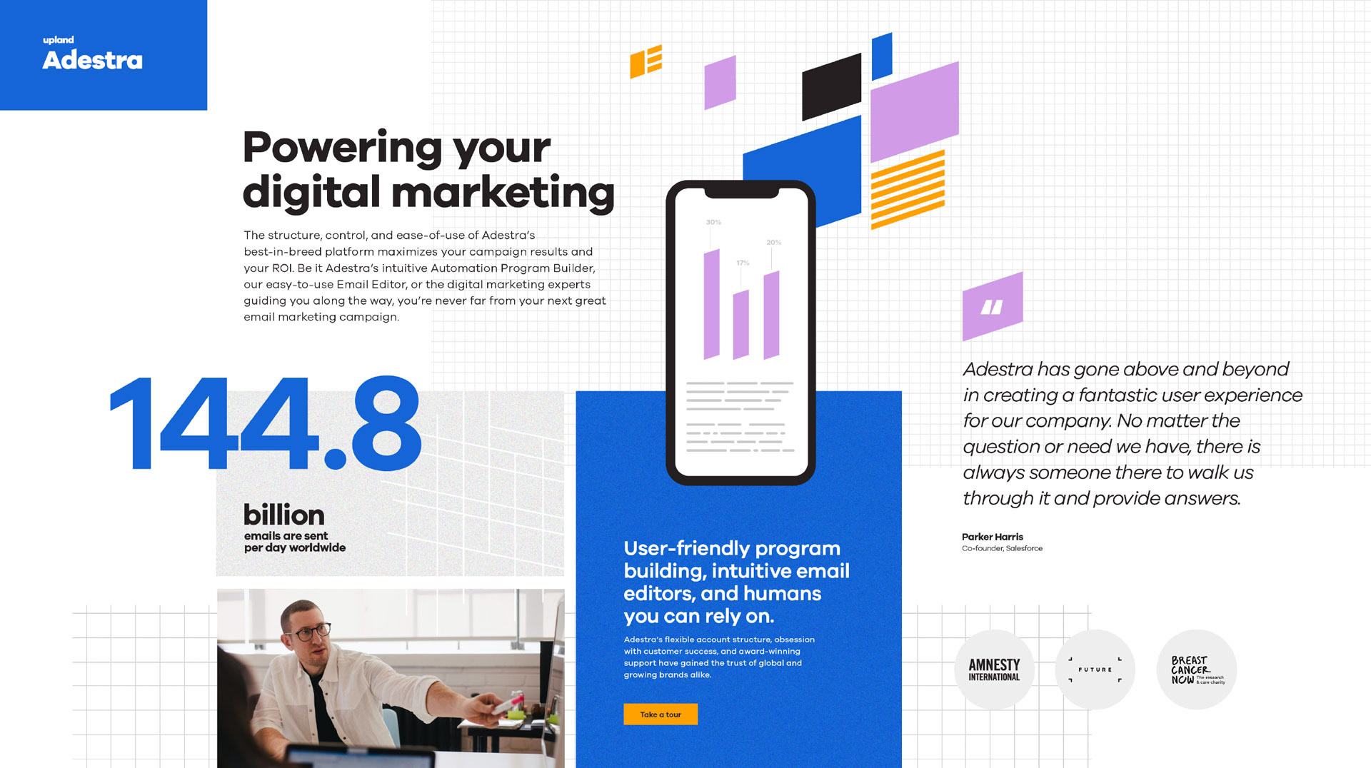
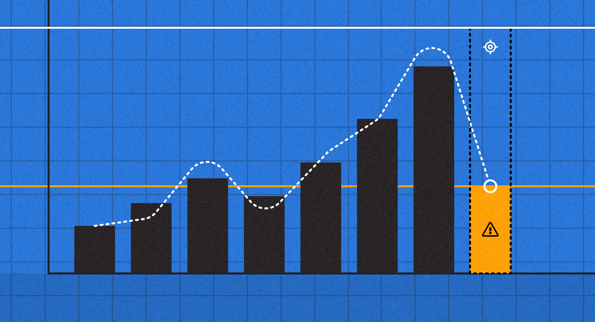
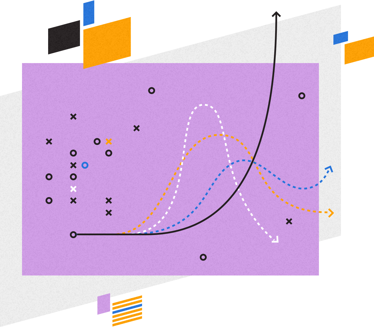
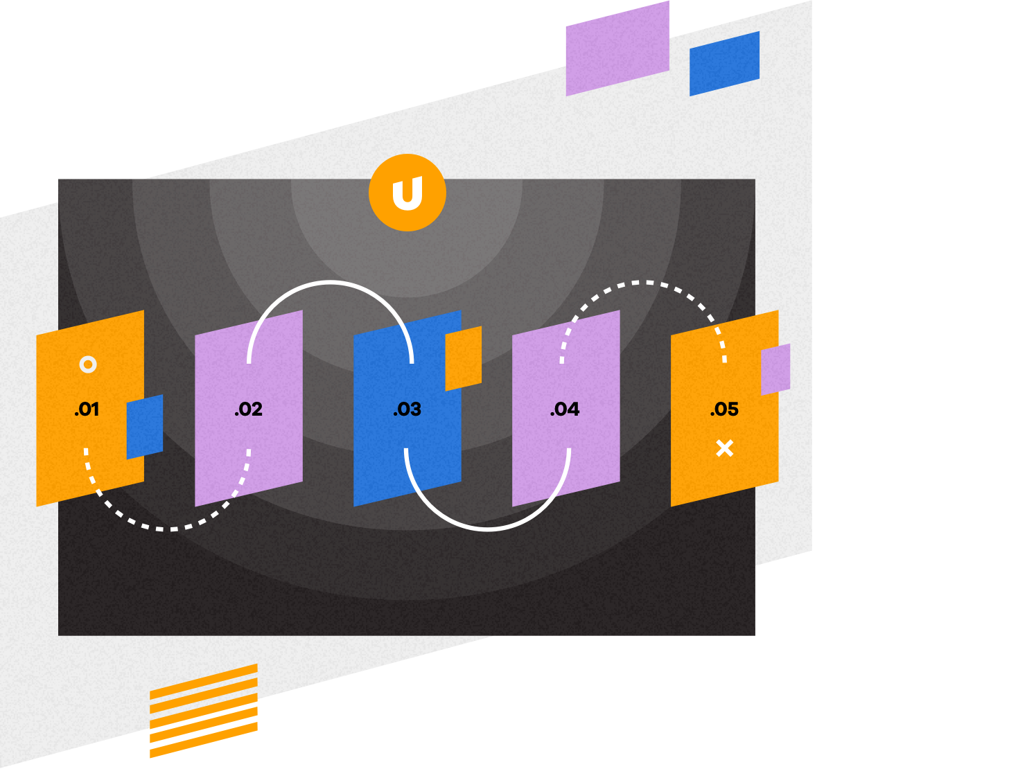
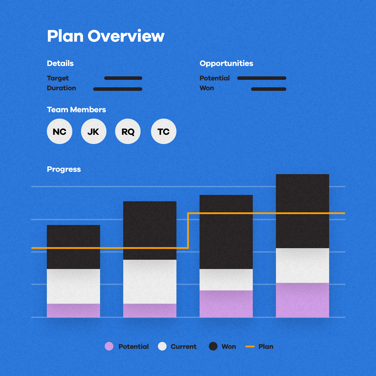
Illustration plays a big part in the brand system. By leveraging the foundational components of line work, color, simple shape, and our unique slanted angle, we arrive at an illustration style that's own-able for the brand. Additionally, this approach allows us to quickly conceptualize and showcase product features for newly acquired tech, something Upland does 4-6 times per calendar year.
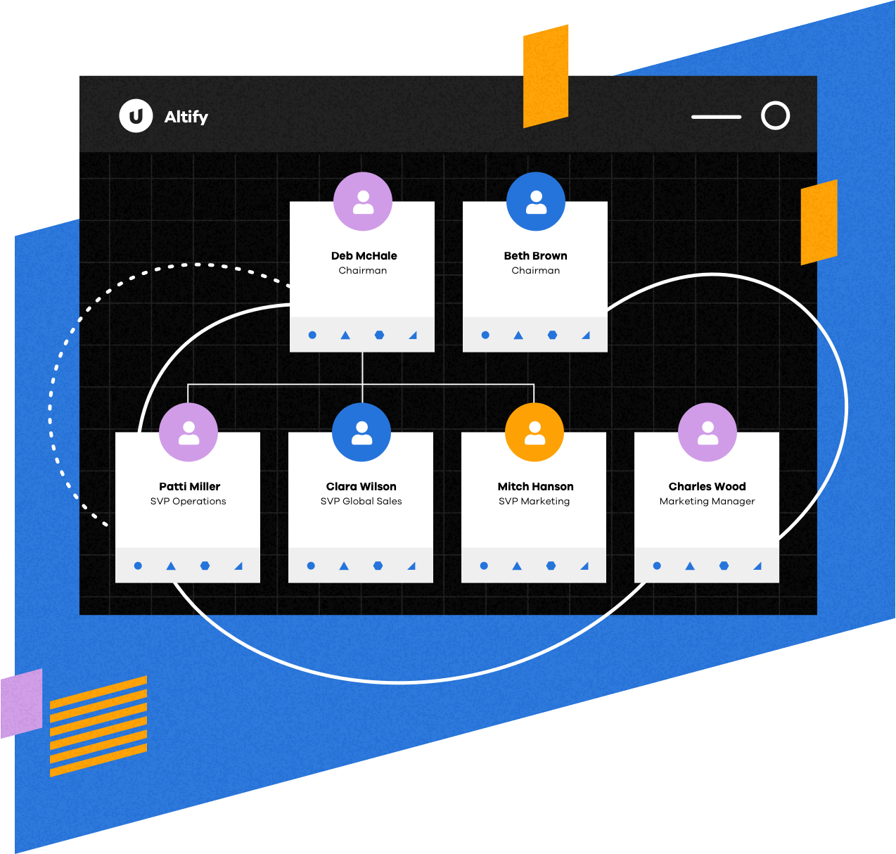
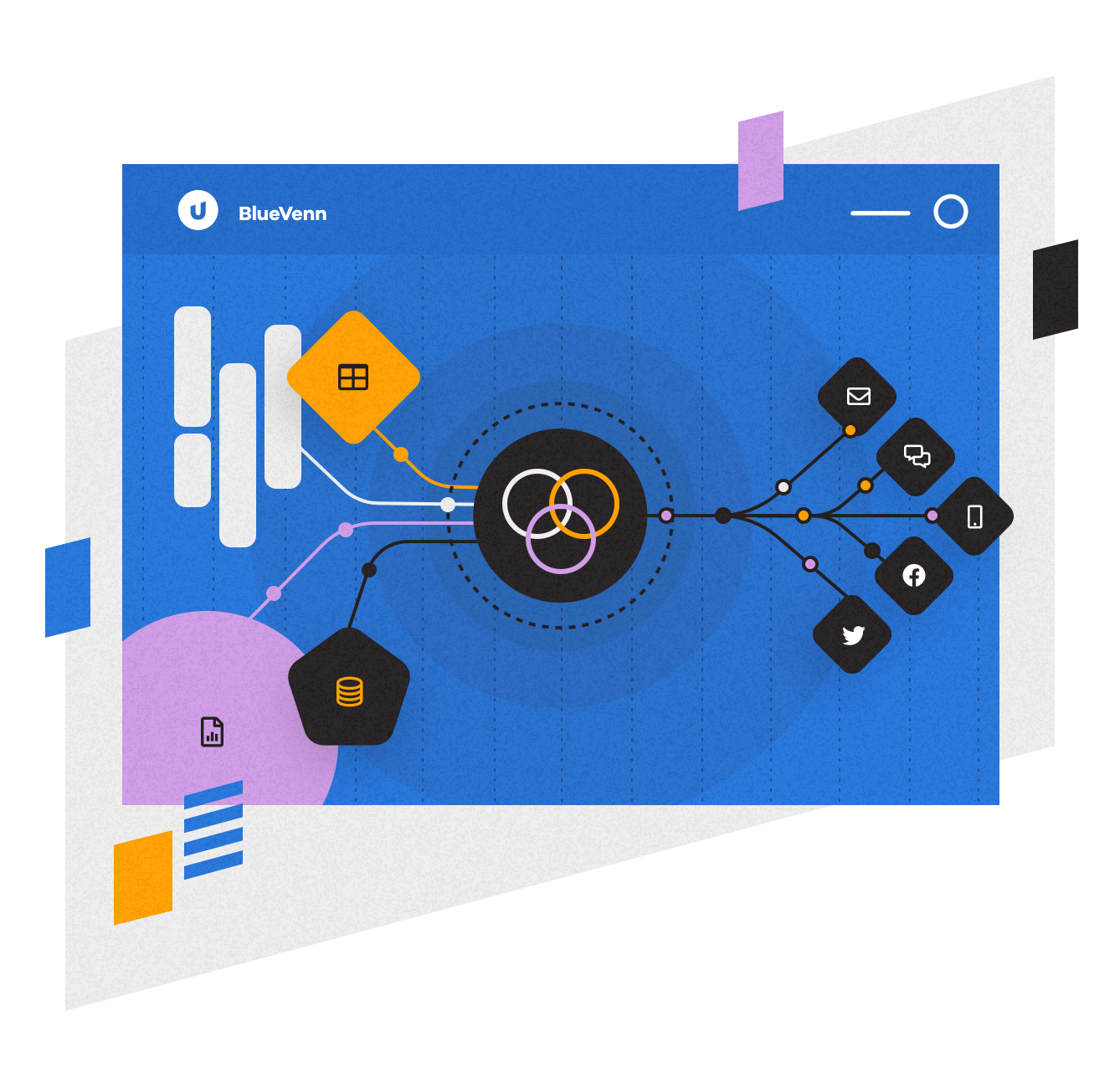
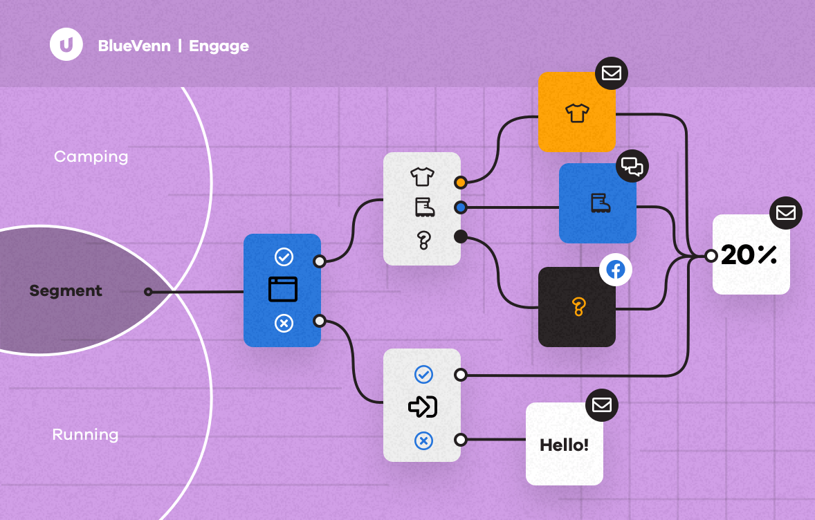
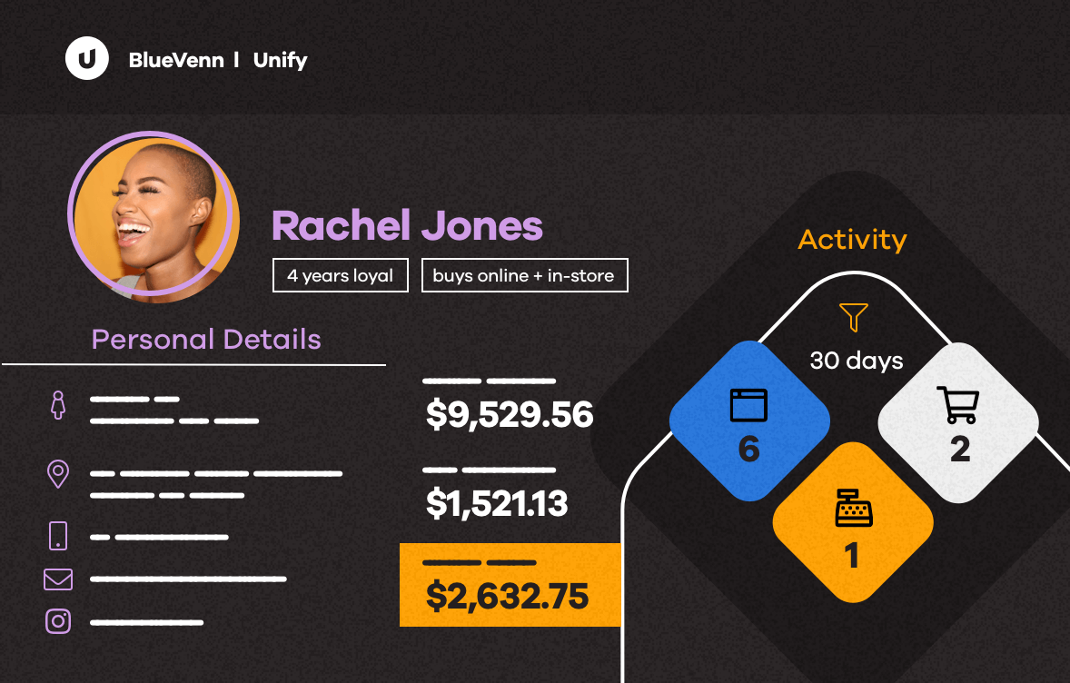
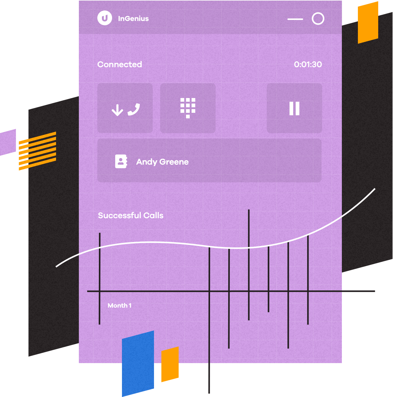
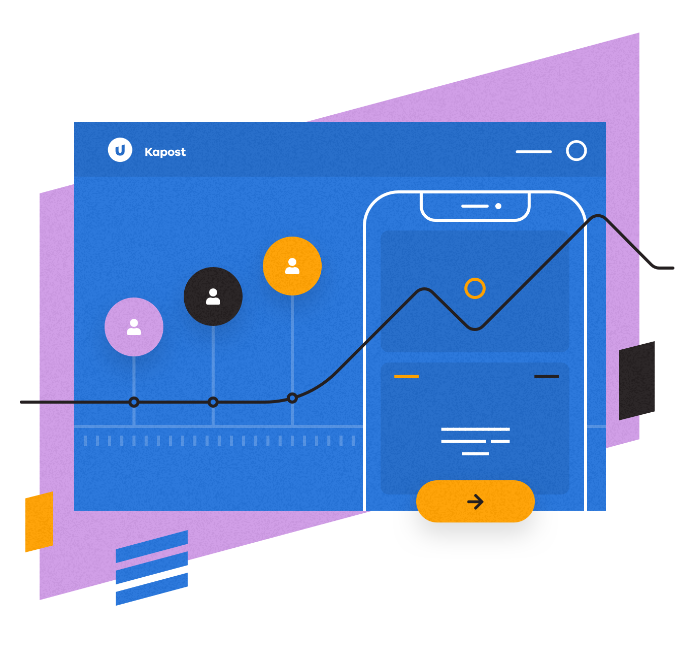
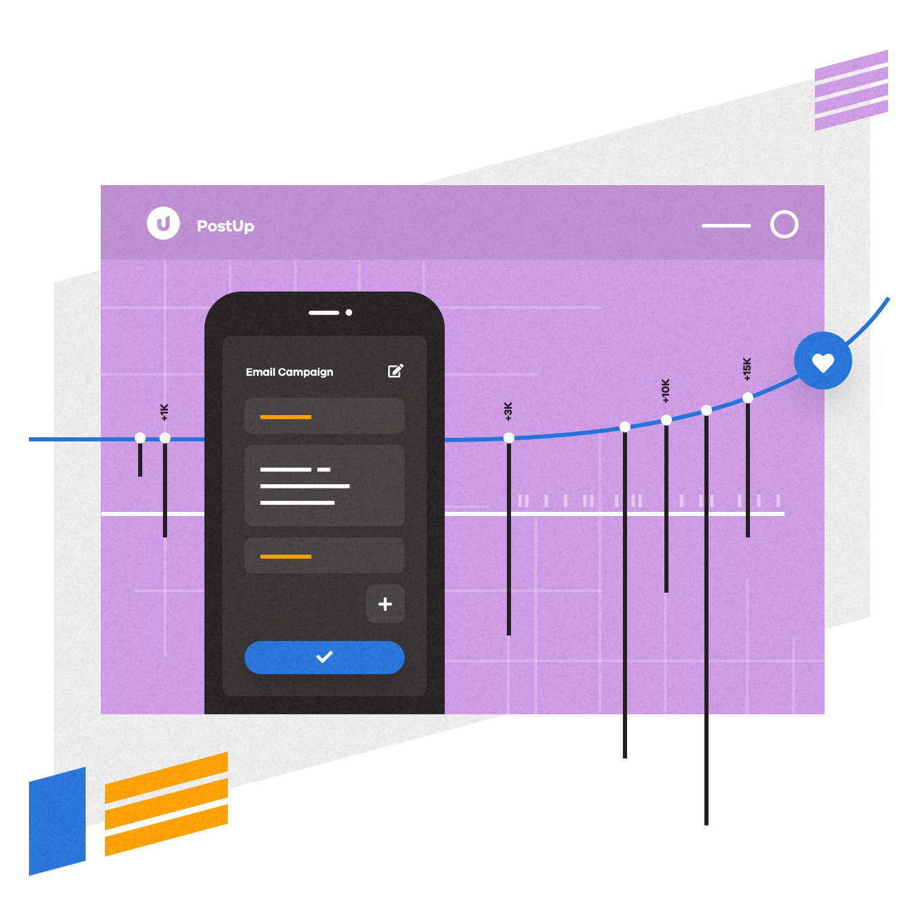
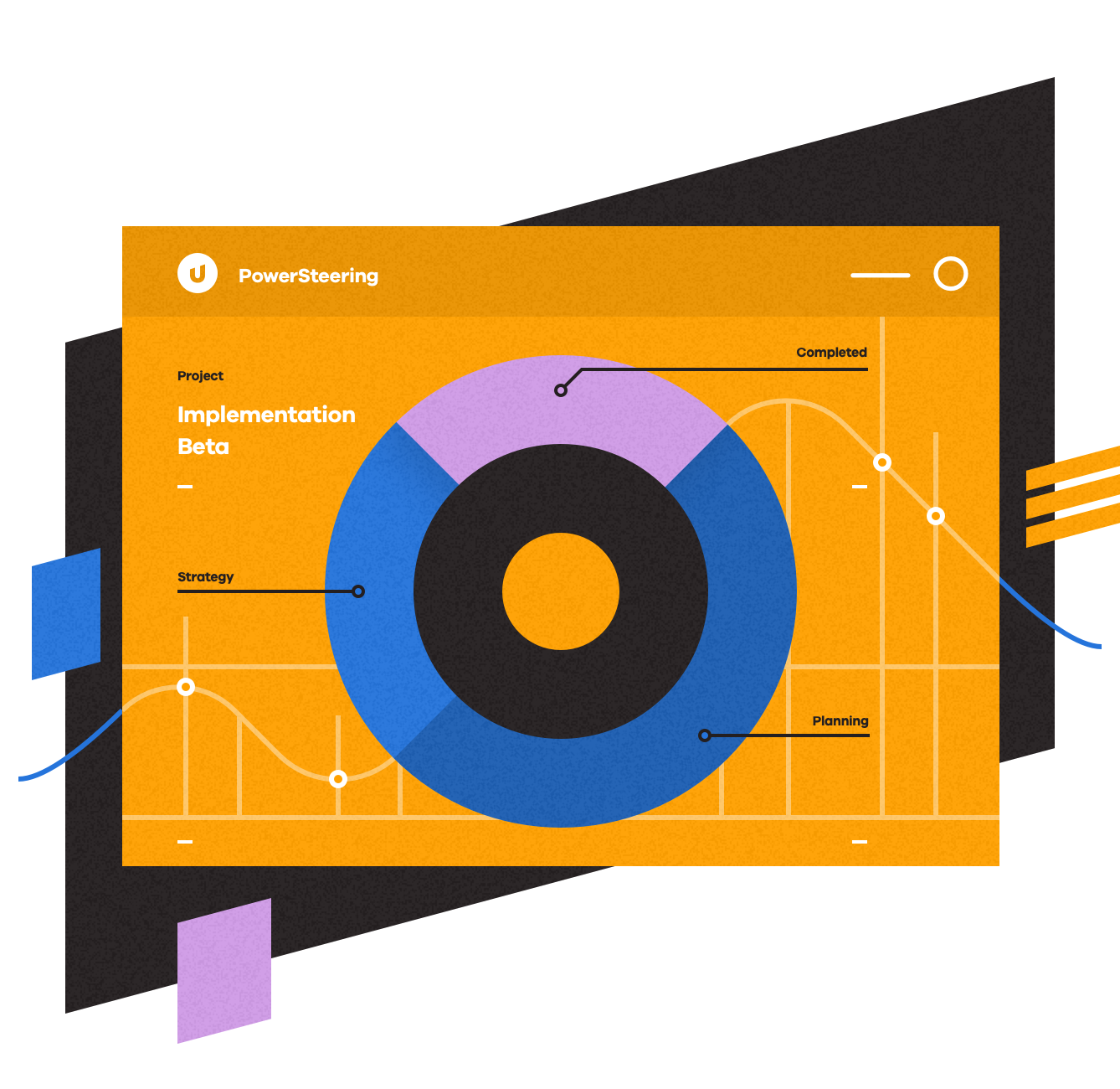
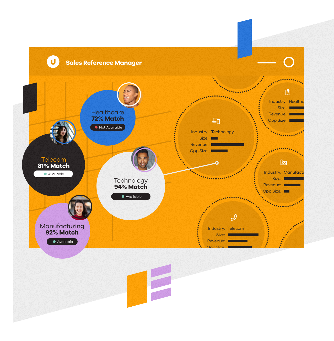

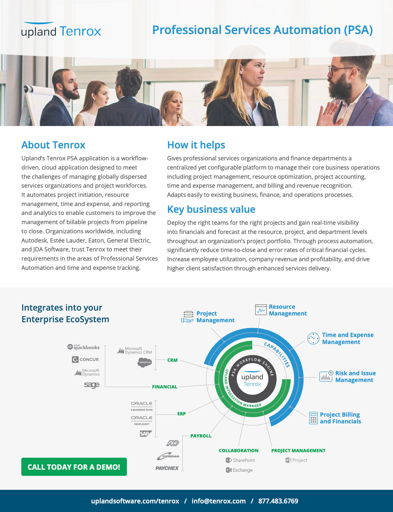
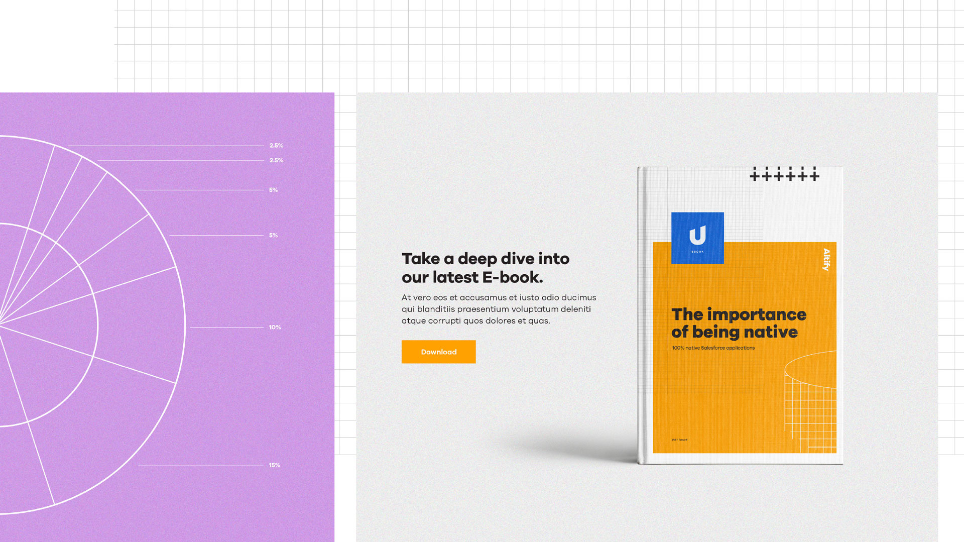
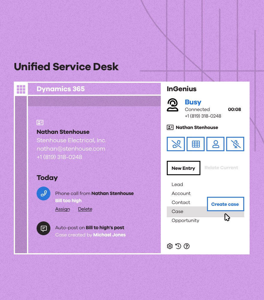
Turning up the fidelity on the illustrations one more notch, we can use the same direction to simplify and stylize screenshots. This is incredibly important to promote a sense of consistency across the products, as it takes time to transition a newly acquired product into the new design language system. In the mean time, we can leverage stylized screens to communicate functionality, while also reducing visual complexity and focusing the viewer on specific features:
From the very start, we knew that this illustration direction opened up huge opportunities for motion. We've had a few opportunities to experiment with full videos as well as looping GIFs, with very promising results.
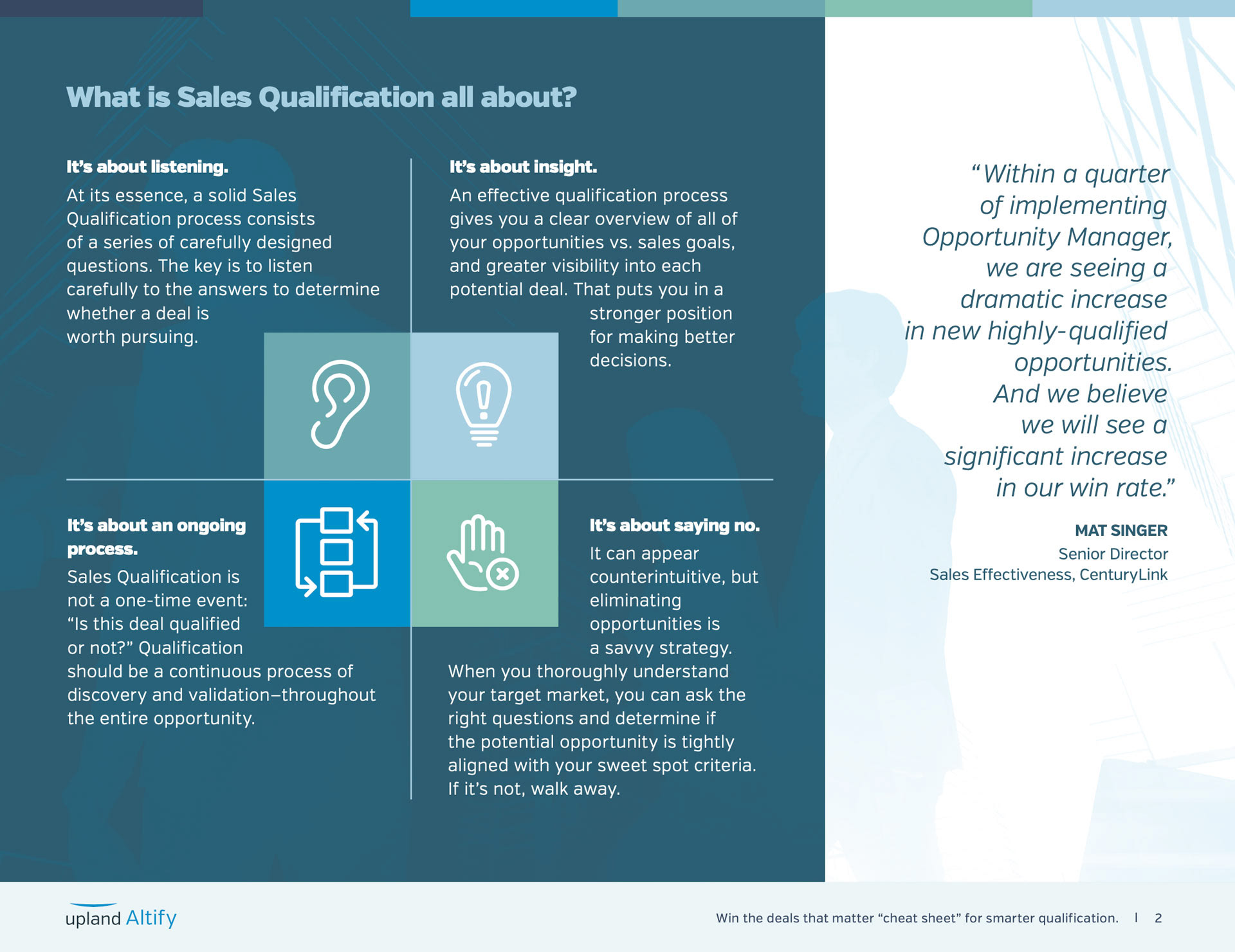
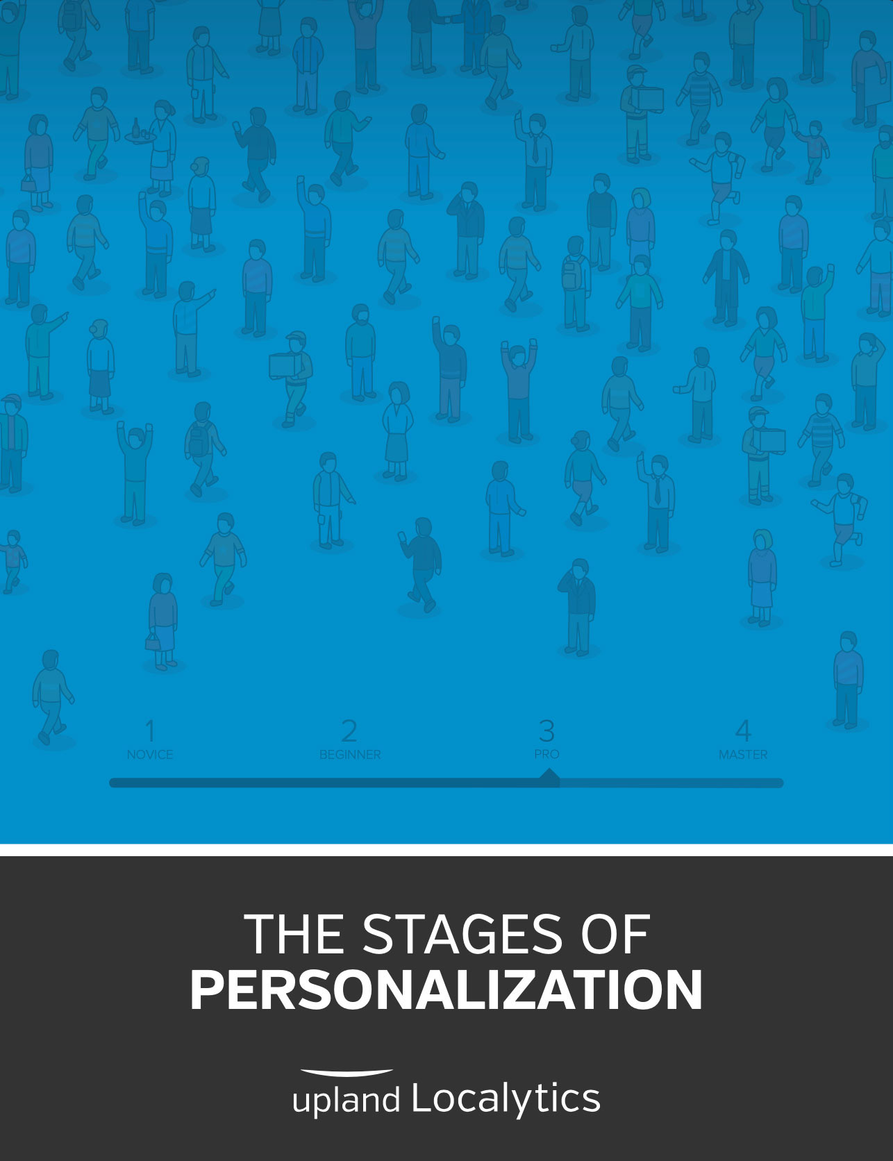
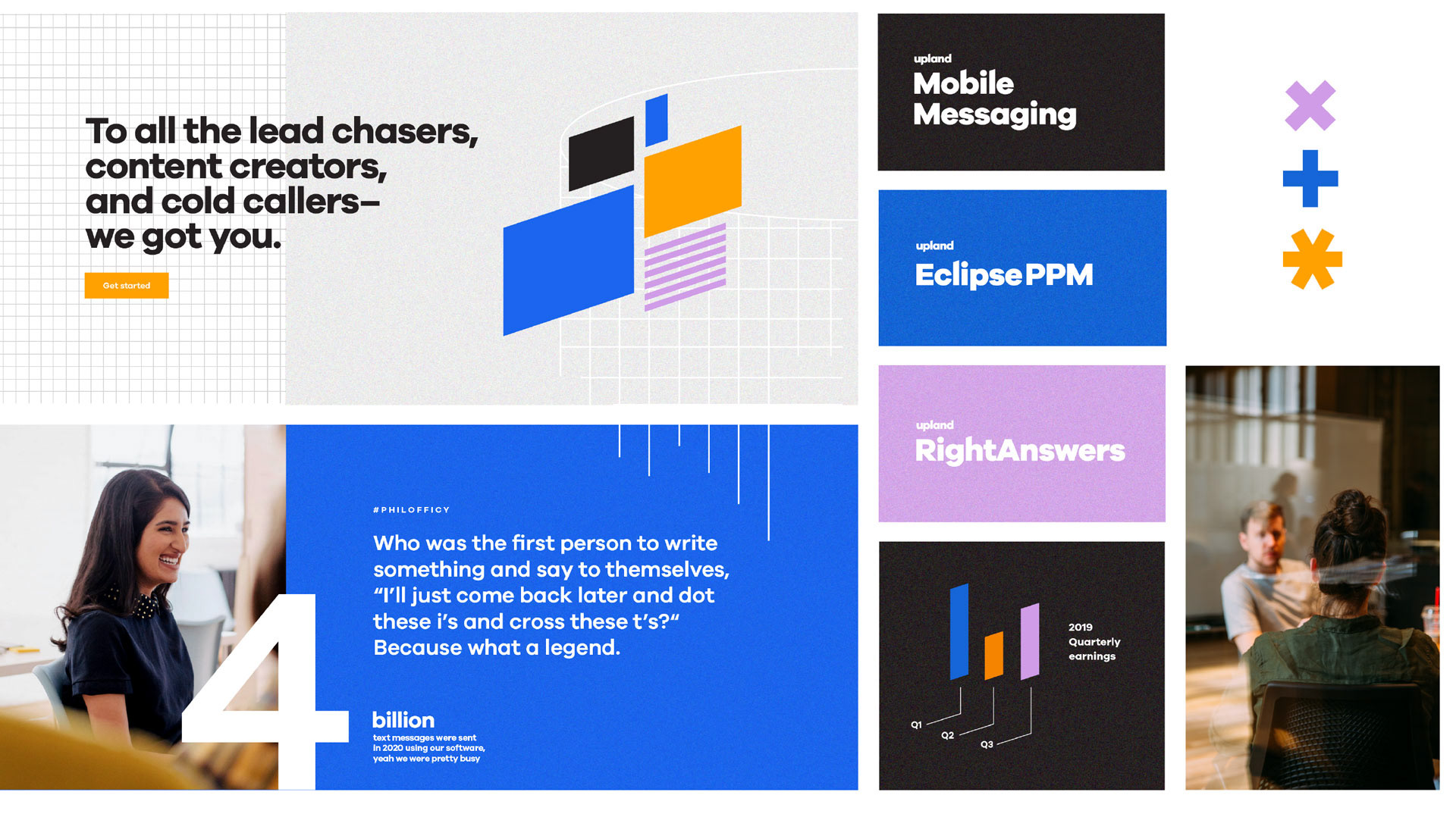
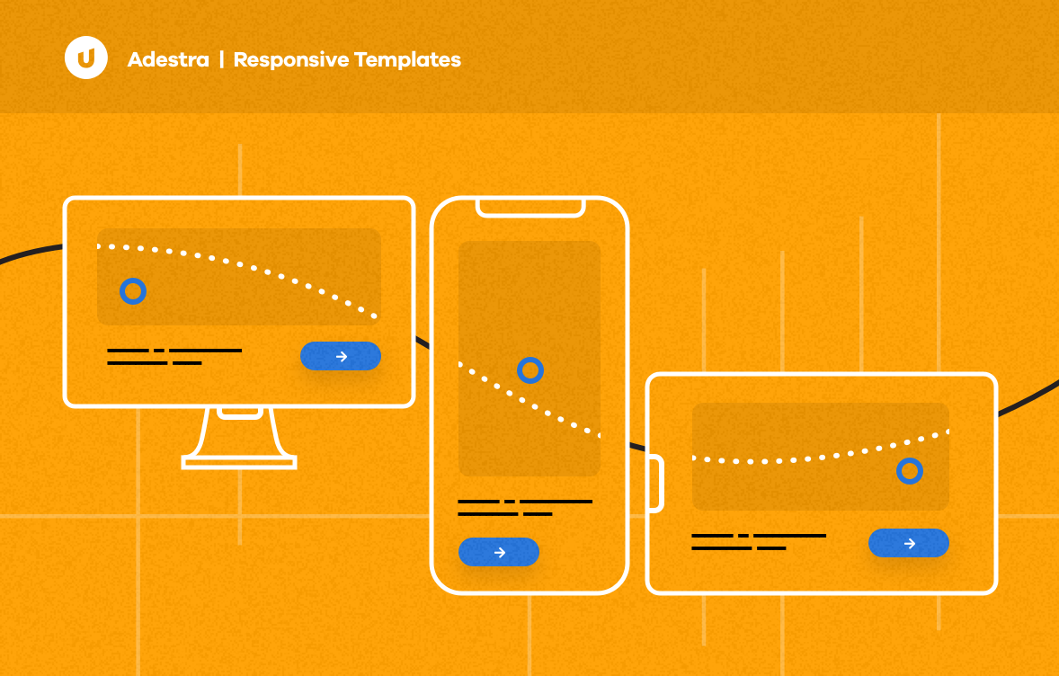
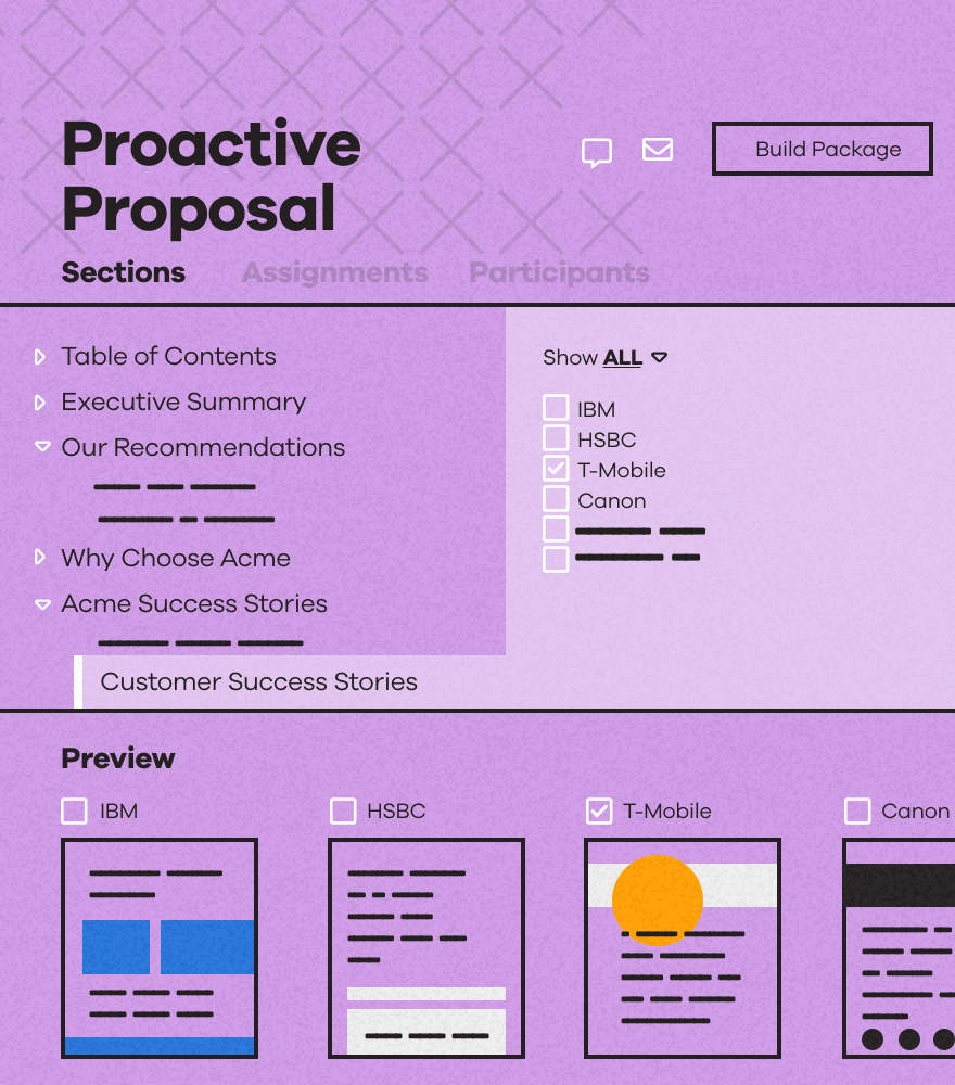
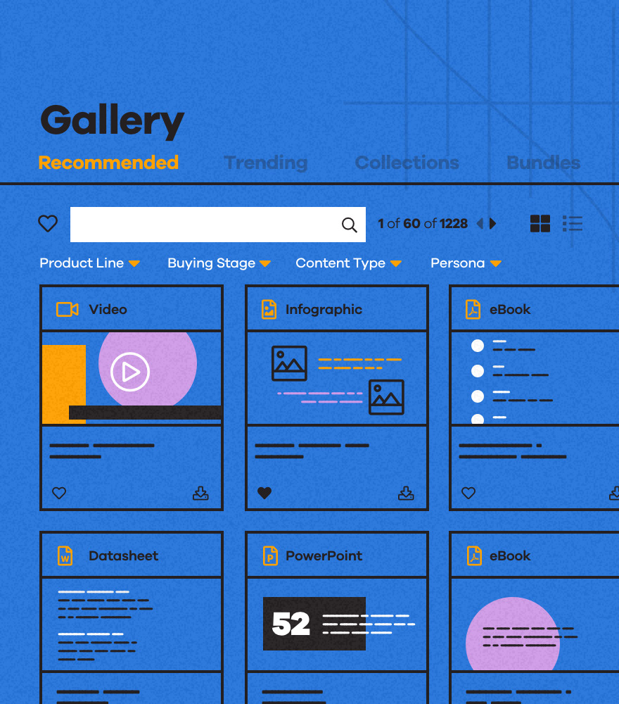
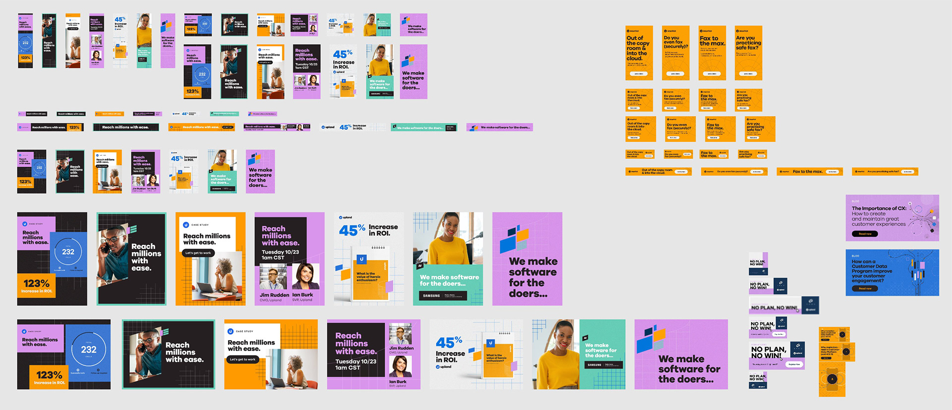
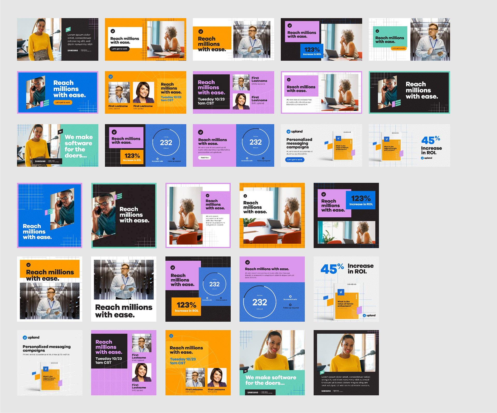
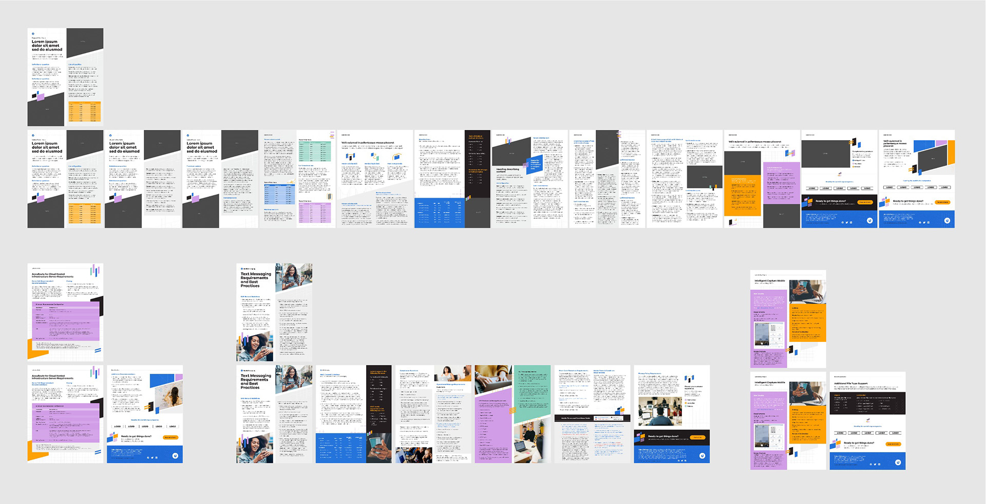
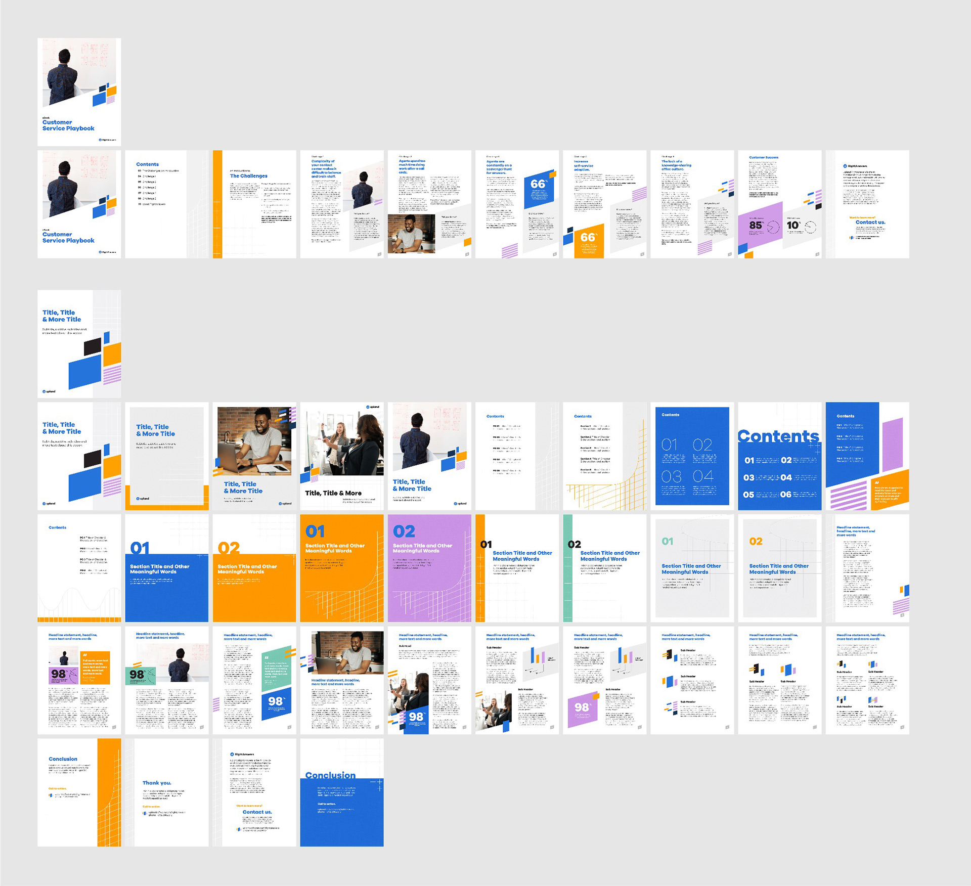
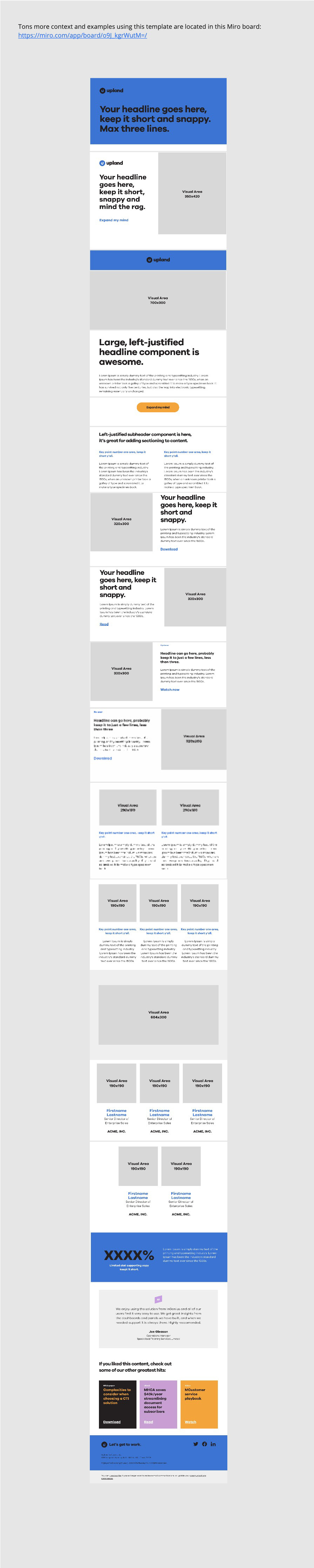
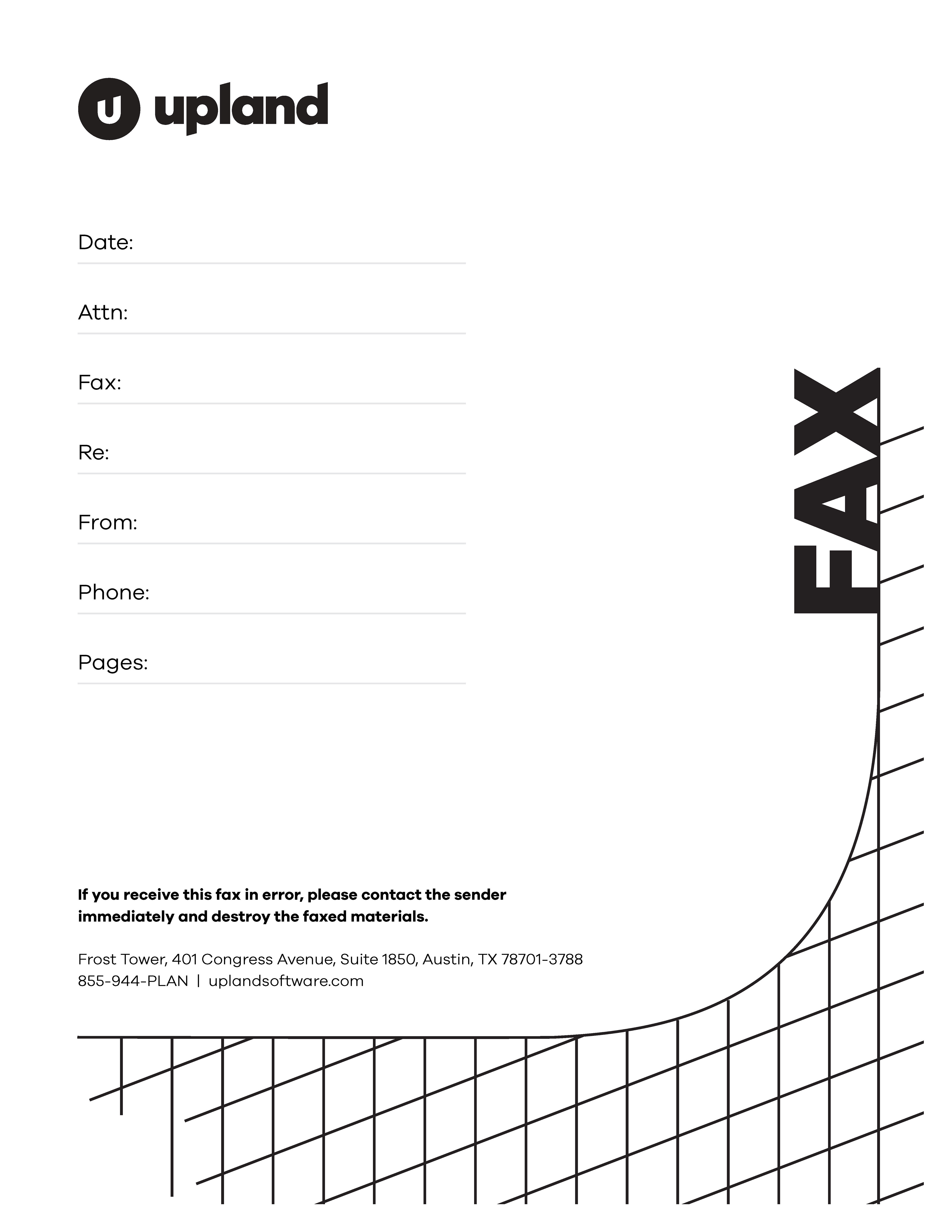
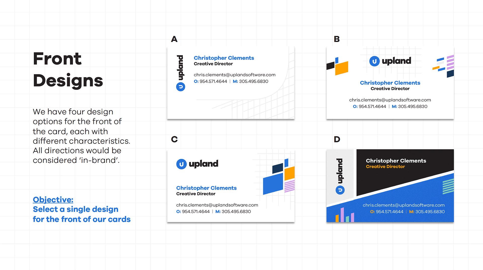
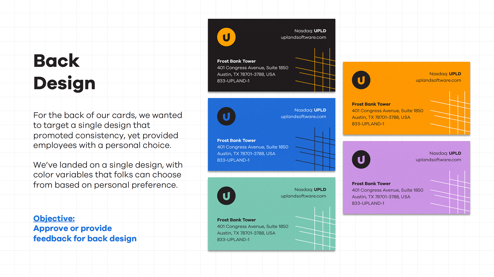
An important part of any brand system are it's templates, and there was certainly no shortage of template needs for Upland. Working with our newly defined brand system, we engaged internal and external designers to create a library of templates covering a wide variety of use cases.
Social and display ads:
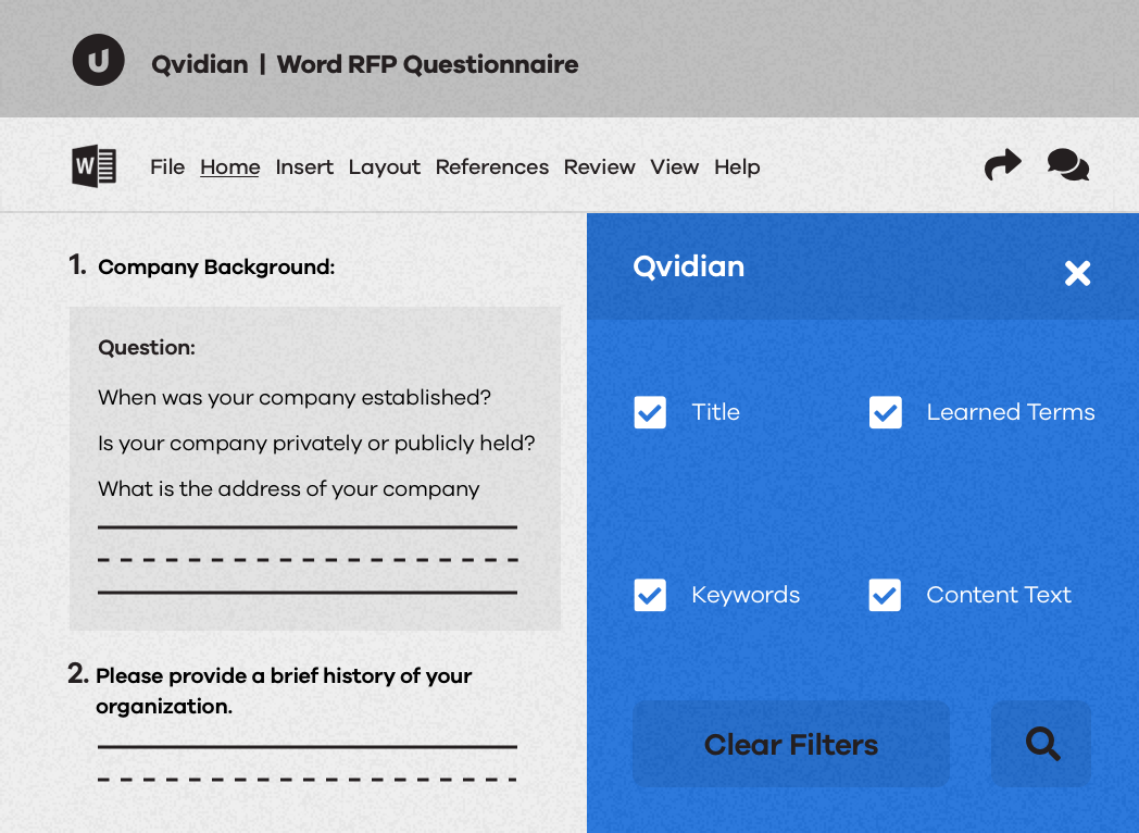
Documentation and sales enablement:

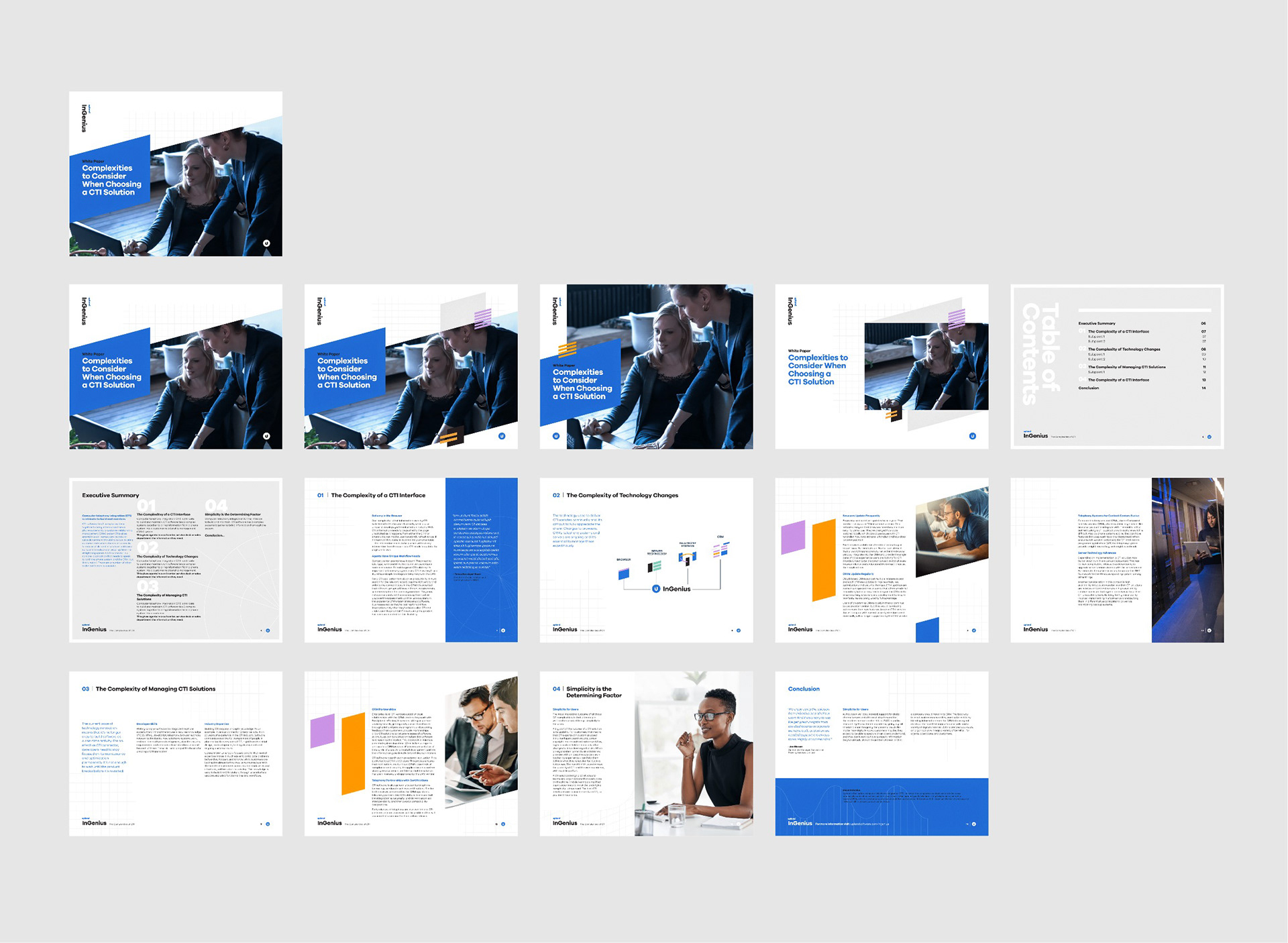
eBook and Whitepaper:
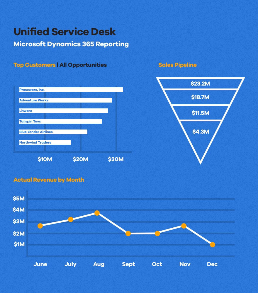
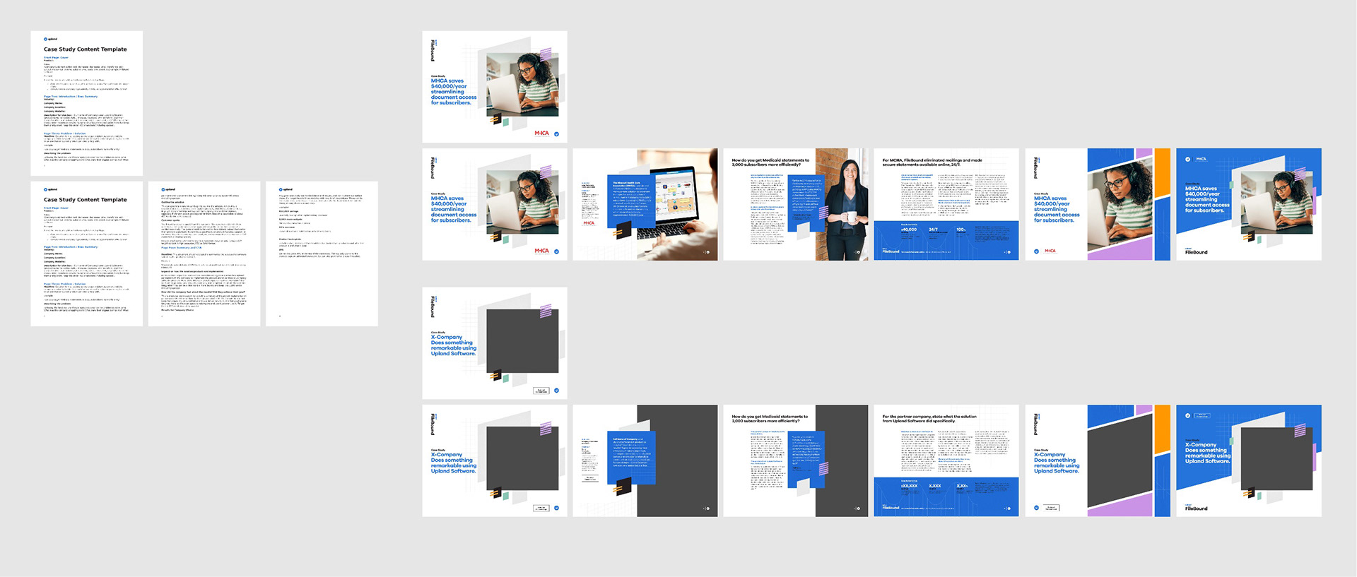
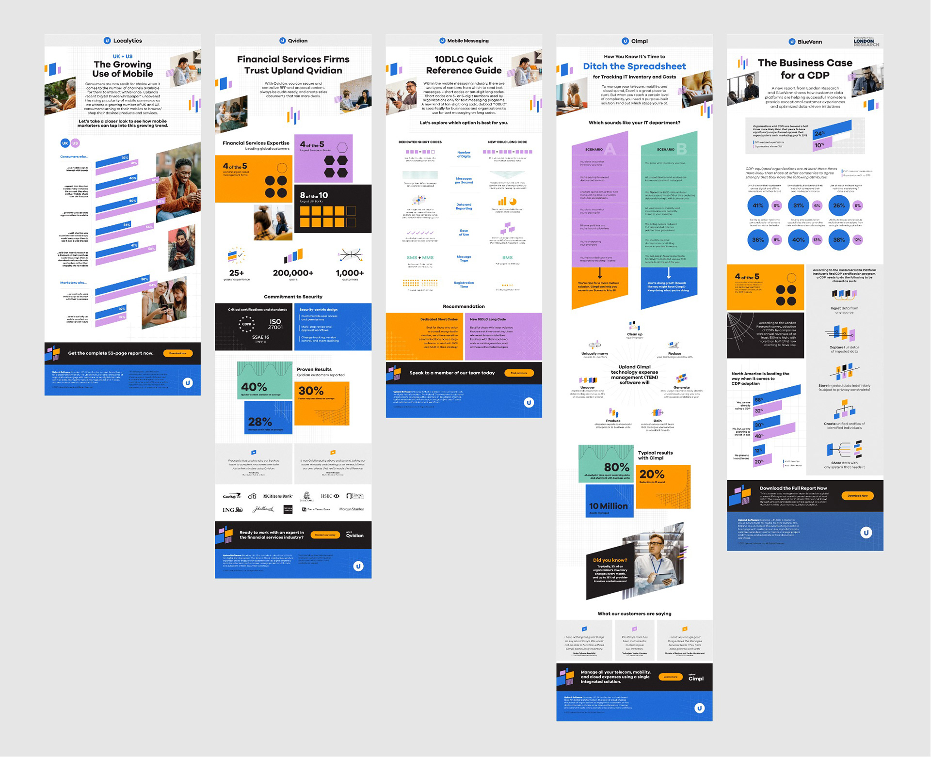
Case study and Infographic:
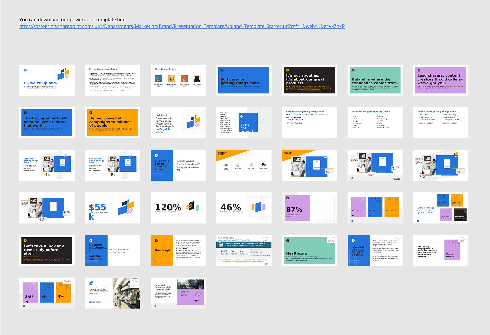
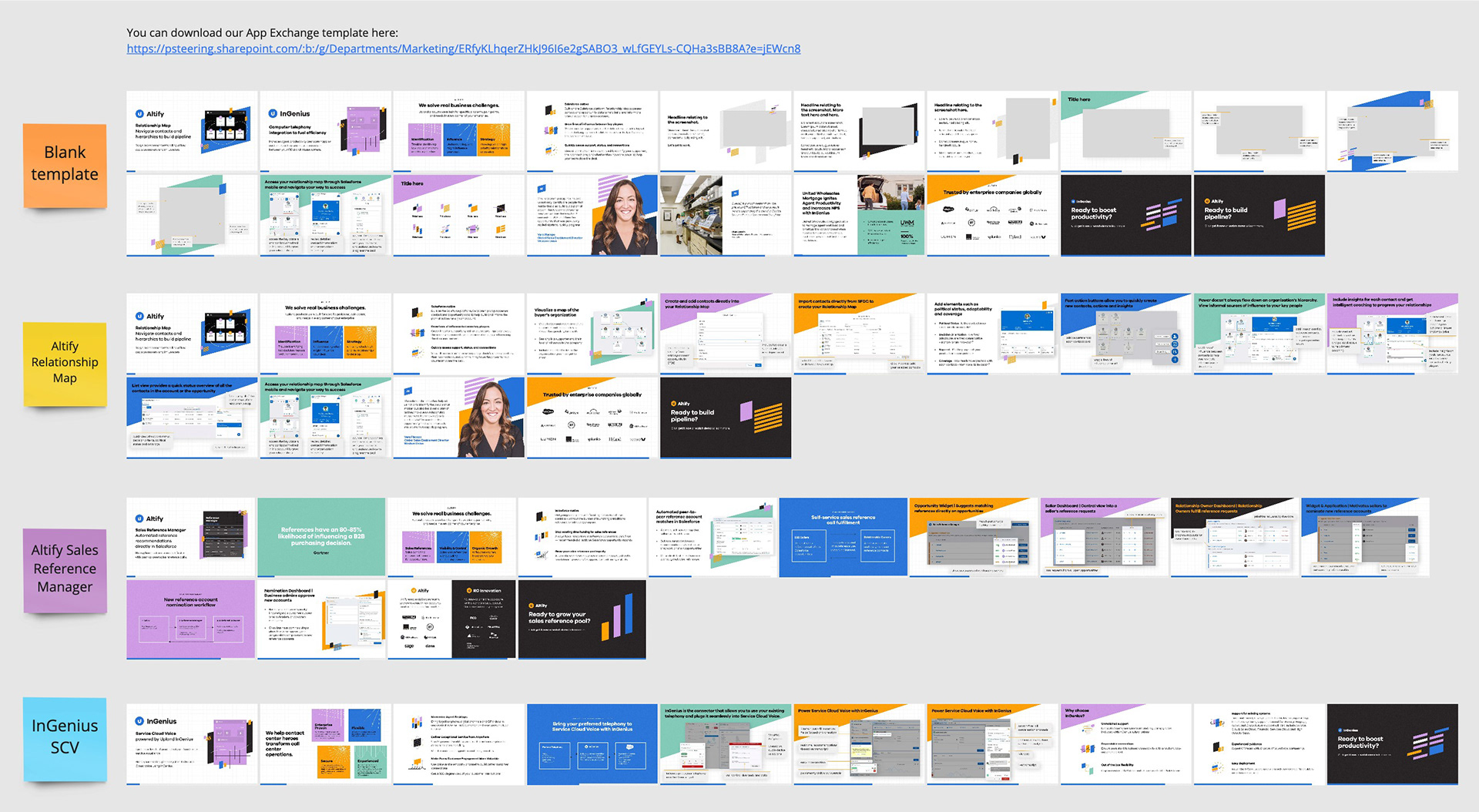
Powerpoint and Salesforce App Exchange:
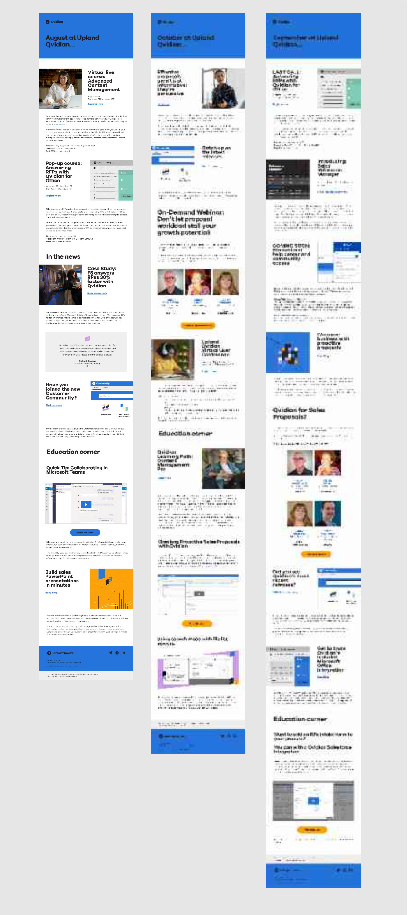
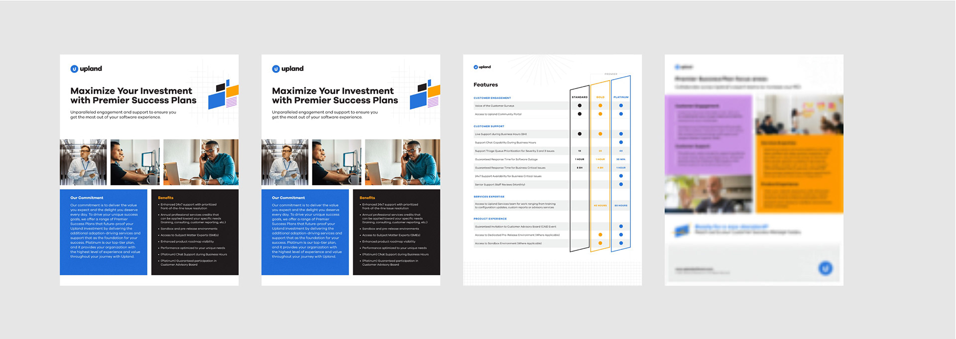
Email and service plans:
and of course all the obligatory office-type documents:
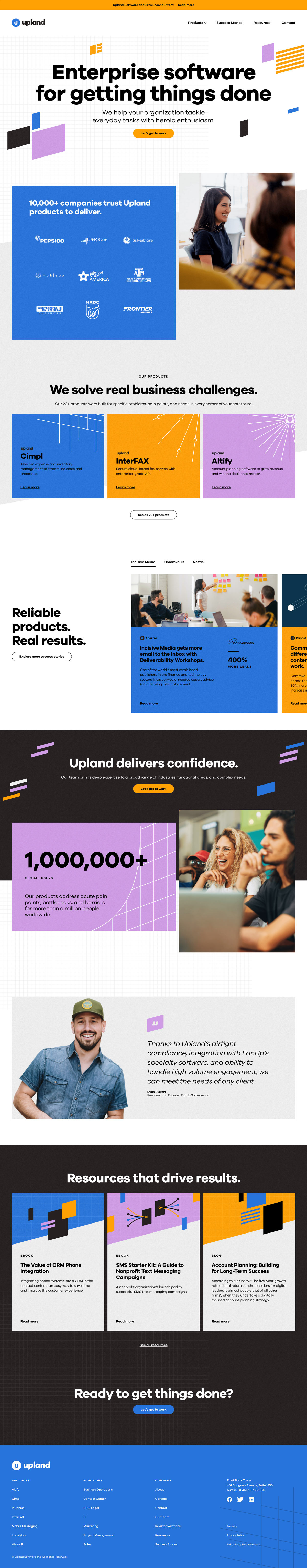
One of the most signifiant changes was our web presence, as evidenced by the stark difference between old and new home pages:
To get a taste for the various modules and layouts that we implemented for the new site, check out the Figma project and prototype below:
With a project as massive as this, it 100% takes an army of talented folks to get it done. My sincerest thanks go out to key internal and external players who helped bring this new brand to life:
Always-resilient Uplanders:
Jim Rudden, Virginia Miracle, Meredith Begin, Rod Favaron, Kendell Kelton, Sara Whitwer, Justin Schiavoni, Rachel Quinn, Daiko Hachiya & the product design team.
Design and branding legends who lent their time and talents to build out system:
Brett Eaton and Sharon Arellano and the Unfettered team, Shane Bzdok, John Norton, Gray Luckett and The Graphic Standard team, Rex Burns, Tom Reardon, Courtney Boyle, Annalee Lanier, Paulo Selletti @ Hypnotic Design, Dustin Scott @ GreatJob.TV, Megan Willin, Maggie Moore, Mariella Krause, Scott McAfee, Zoe Randolph, Barry Epstein, Todd Kelgard and the Ovation Solutions team.
Y'all moved mountains. Thank you.